21 Best Contractor Website Designs
Web design is an integral part of your marketing strategy. A well-designed site can bring in new business to your contractor company. So, if you’re not getting customers or at least queries about your services, then you, as a business owner, must look at ways to improve your site’s functionality and appearance. This post looks at some of the best contractor website designs you can use as an inspiration for yours.
21 Best Contractor Websites
If you want your contractor, home services, or HVAC website to achieve its goals of attracting more prospects and clients, you need to take cues from the design elements and layout in the sites below. Most of them are designed on WordPress and will show you a thing or two about how you should approach the web development of your site moving forward.
1. Oasis Builders

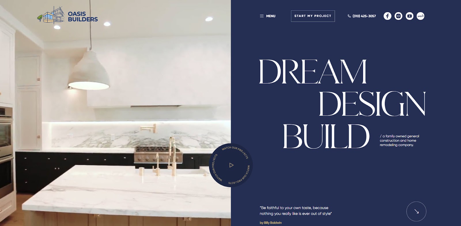
Oasis Builders has one of the best general contractor websites out there. The choice of fonts and their layout on the web page makes reading and navigating easier. The blue and white color scheme looks deceptively simple but presents the information elegantly. All these elements make for a visually appealing and harmonious theme.
The website also boasts excellent UI. The ‘How We Work’ uses a timeline design where visitors click on the different steps in its home modeling process to show more information on each. Additionally, the high-quality photos have an effect that moves the image closer to the screen as you hover over it with your cursor, which adds to the site’s dynamism.
2. West Village GC

West Village GC has an eye-catching logo above the fold that slowly creeps up to your screen, a sign of good things to come. Below is a high-resolution video explaining what this contractor brand does with fewer words. The website then goes straight to showcasing photos of luxury renovations it has worked on, again emphasizing the “show, not tell” approach in web design.
The website continues to discuss its company and process through another high-res video consistent with its brand. The white, gray, and orange color scheme helps the calls to action (CTAs) stand out even more. It also helps that the contact form button on the menu scrolls down with the visitors so they can click on it whenever they’re ready.
3. JDG Constructions

The first thing visitors will notice about JDG Construction is its liberal use of white space. It allows the page sections and elements to breathe properly without making the layout look barren. It also helps that all the elements have animations when you scroll down the page. They help make the navigation smooth and intuitive, guiding users through the content effortlessly.
The Project section of the homepage stands out the most because it changes the background color from white to black. It features in high-quality images the different renovations the construction company has a hand in. The CTA only appears at the bottom of the page, which is a bold choice that worked in the end, considering how well-crafted the site’s UI is.
4. Admer Construction Group

Admer Construction Group takes a tried and true approach to its website design. The above-the-fold features a high-quality hero image and a call to action in the middle. There’s also a CTA button and phone number on the menu that follows you as you browse the page. The How It Works section presents the company’s process in a very engaging and interactive way.
The construction business website has a fair mix of text and images. Both are also presented as well-organized and structured to retain the site’s visual appeal. Finally, its white and dark blue palette provides a clean, well-structured design that evokes professionalism.
5. Home Care Contractors

Home Care Contractors is another contractor business website with a clean and professional design. Its black and white color scheme is evident from the start, in which the white CTA buttons stand out against the dark background above the fold. The color switch places as you scroll the page, with the black buttons on a white background immediately catching your eye.
The flow of information on the website is also well thought-out. The How It Works section entails the company’s contractor process and is followed by the different services it offers and the projects it has worked on through the years. At the bottom of the page are customer reviews and awards the company won, which could help influence visitors to contact their services.
6. Lindholm Roofing

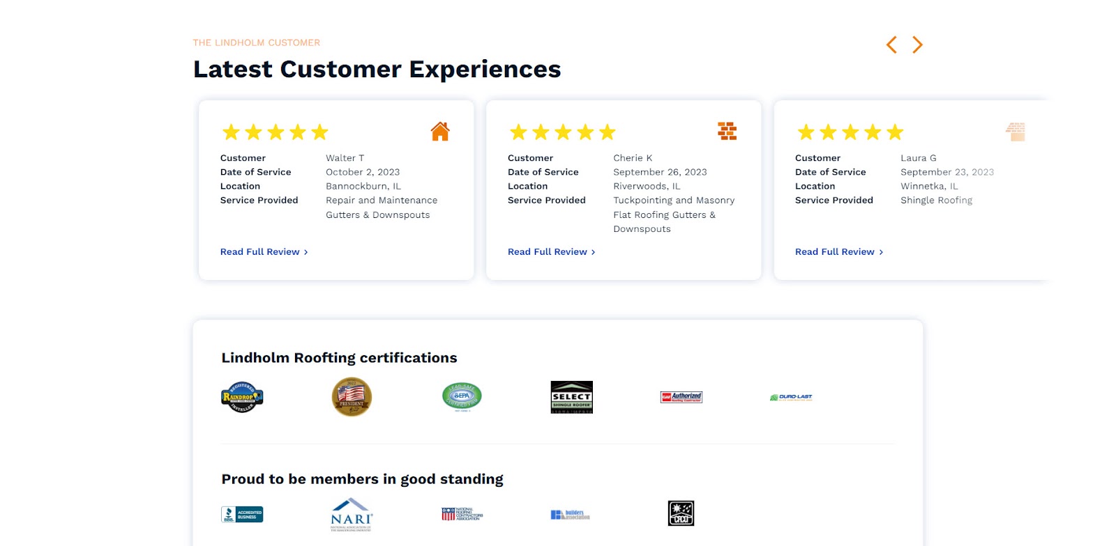
Lindholm Roofing emphasizes “family” on the copy above the fold. That’s because the company is a family-owned business, evident from the family picture in the middle of the page, that has been helping homes in the Chigaco area for decades. This allows the brand to make a more personal connection with its audience.
The web design also takes an intuitive and straightforward approach by presenting its services and processes in an easy-to-understand manner. However, the site focuses on social proof, like its latest customer experiences, certifications, and accreditation, all of which contribute to the services’ effectiveness.
7. Honest Renovators

“We’re not your typical contractors” is the first line on the Honest Renovators homepage, which sets the tone for its web copy. It uses lots of specific language that people in the Pittsburg area will understand, and that’s a good thing since they are its potential customers. The humor is also palpable in the copy, contrasting with the serious and professional copy in most sites in this list.
The web design uses lots of white space to give each section breathing room. The font size varies, which is to emphasize important parts over less important ones.
8. Got Rot

I Got Rot aims for familiarity in its above-the-fold section. It takes inspiration from the “Got Milk?” ads in the ‘90s to develop this simplistic yet compelling website design. The website also simplifies the How It Works and Our Services section by using clickable icons to provide more information about what the home improvement website does.
The site also delves deep into the issue of dry rot and how homeowners should deal with it. It doesn’t suggest their business as the solution–it first provides value to visitors on how to treat dry rot. This shows their expertise in the matter, allowing more people to request a free quote.
9. Miami Tile

Miami Tile provides more than enough information to visitors about its contracting business. It has an equal amount of text and images to communicate its services and reasons why it should choose this business over others.
The high-quality images used under the completed projects section show what Miami Tile is capable of. It also helps that the site shows leading brands that trust its services. There are also customer reviews at the bottom of the page to help you decide whether the company can help you with your home builder needs.
10. Construction Pros

Unlike most sites here, Construction Pros is an insurance company that caters to contractors who want to grow their businesses. This is clear from the above-the-fold section, with multiple CTA buttons addressing professional contractors’ concerns.
The web design manages to streamline the information its website visitors are looking for on the site. People can click on the different services it offers or search for the type of contractor they are on the page to find more details about each one. The menu also makes accessing the different pages on the website much easier.
11. Shangri-La Construction

The high-resolution video that automatically plays sets the stage for the kind of brand Shangri-La Construction is. Scrolling down the page, visitors see its featured projects in high-quality photos. Clicking on each one shows more information and photos about the project to showcase further the kind of work the construction company is accustomed to doing.
While there isn’t a lot of text on the website, they share the same size across all pages, making them easier to read.
12. Castle Homes

Castle Homes revels in the luxury of projects it has completed for clients over time. This is very clear from the carousel photos in the above-the-fold sections and the mosaic of photos underneath it. Also, the lack of text on the homepage is deliberate–it lets the images of the completed projects do the talking.
13. Robert Carpentry

Robert Carpenter prides himself in the craftsmanship of his custom woodwork. The photos featured on the homepage perfectly represent the quality he strives for. The wide shots of the pictures give visitors perspective on how its handcrafted products fit in with the room’s luxurious interiors.
Aside from showcasing its portfolio, the site has links to its services and contact pages across the homepage. At the bottom of the page is the contact form that visitors can fill out once they’ve been impressed with the quality of work the company has produced.
14. Schmitt + Company

Schmitt + Company is responsible for some of the most luxurious-looking wineries and residences in Napa Valley. And the website lets you know about it, with beautiful wide shots of properties they helped build in the area.
Scrolling down the page, you’ll see a gallery of other properties the company has worked on through the years. Clicking on each one provides additional information about the estate and its architectural design.
15. Continental Electrical Construction Company

Continental Electrical Construction Company takes on a more familiar web design as it features everything you need to know about the company. The Services section has clickable icons describing each service and opens a new page to discuss it.
The site also showcases the company’s latest projects you can click on. Each project page has a short video and additional details about it. Finally, the website uses the same red CTA button to stand out from the white background and get more people to click on it.
16. AP Remodeling

AP Remodeling shows a carousel of its completed projects in high-quality images. Just below it is the Client Stories section containing videos of satisfied customers. It also shows testimonials of past and current clients and the number of reviews and high-star ratings it received from review sites like Facebook, Yelp, and others.
The Projects Gallery section shows other completed works in large images to emphasize the quality of work the company produces. There are also fixed widgets where you can call, email, or message the company and view more of its projects. Finally, this is the only site with clear project pricing (a minimum of $20k). This helps set clear expectations for people before contacting the company for its services.
17. Mission Critical, LLC

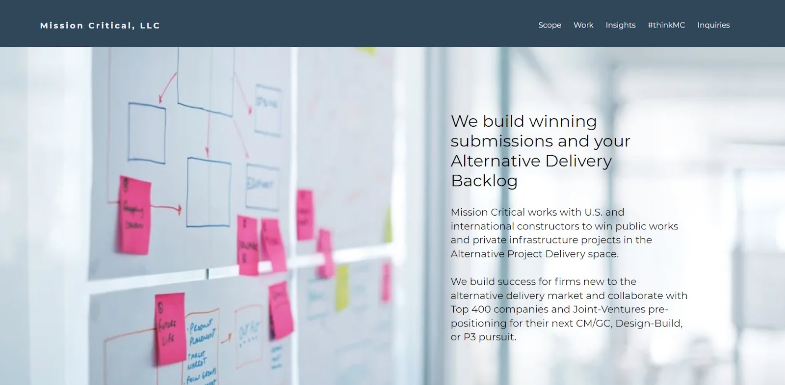
Mission Critical, LLC’s web design process is to keep everything simple. Each section has an image and accompanying text explaining what the company can do for its clients. It also talks about the markets it caters to, the clients it has worked with, and who to contact for inquiries. Its bare-bones website design communicates its messages well enough, which is more than you can say about other sites.
18. Tulsa Masonry Design

Tulsa Masonry Design stands out for being one of the only residential and commercial masonry contractors in the area. The Project Gallery and Reviews sections showcase their work and what customers say about its services. There’s also a section of the masonry’s certifications and accreditations. They all help separate the company from the rest and make a case for visitors to hire its services.
19. King Plumbing, Heating, & AC

One thing that truly stands out about King Plumbing, Heating, & AC are the images used on the homepage. Not just because they’re of good quality but because they feature vans and trucks used by the company on the job. There are also photos of the owner, which gives the website a more personal touch. The high scores from its customer testimonials add the finishing touches.
20. Absolute Masonry and Foundation Services

One of the best ways to show the effectiveness of your construction services is before and after photos of a project you worked on, which is what Absolute Masonry did. The company also used photos of unfinished projects in the Services section, which gives visitors an idea of the kind of restoration projects they take up.
21. Joel & Co. Construction

The light and clean theme of Joel & Co. Construction matches the elegant layout of its pages–lots of white space, beautiful typography, and big icons. Regarding the icons, you can find them in the Services section. Click on each one to learn more about the service.
Best Construction Website Design Practices
A good construction company website compels visitors to contact the business for its services. This is easier said than done because various factors must go your site’s way for this to happen. But to increase the chances of getting more service inquiries, observe the best web design practices detailed below:
Offer Good User Experience
A responsive web design is often the precursor to providing visitors with a good UX. This is when the site adapts its layout to the visitor’s screen resolution, whether they’re viewing it on desktops, mobile devices, or everything else in between. Run your site using the Google Lighthouse from your Chrome browser to confirm its responsiveness.
Also, you need to have a fast-loading website. Nobody causes visitors to leave your website faster than when getting them to wait before it completely loads. Your site’s loading speed is also a ranking factor for search engine optimization (SEO). The sooner it loads, the more reason people will stay, and the greater chances it can rank higher on organic search.
To know how fast your site loads, run it using Google Lighthouse or Pagespeed Insights. It breaks down your website loading speed using Core Web Vitals (CWV) scores. Scrolling down the results, you’ll also see suggestions on resolving some of its issues to make it load more efficiently.

Showcase Brand in Design
Your website is an extension of your contractor business. That means you need to use the same font, color, and logo you used on your other marketing materials. Establishing consistency on your website with your brand helps visitors breed familiarity with your business.
Seeing your other marketing assets allows them to recall their previous positive interaction with your brand. Ultimately, observing your brand guidelines on your website allows you to establish a good first impression with visitors that can last a lifetime.
Make CTAs Pop
Since your website aims to help you generate more leads and customers, you want them to commit to your calls to action. And for this to happen, you must ensure that people can see them on your landing page, whether it’s a button that links to your sign-up page or your contact information so they can email or call you.
For starters, you must increase the size of your CTA buttons and use contrasting colors. Regarding the former, make the buttons at least twice as big as your fonts to increase their visibility. And to help you find the best colors for your calls to action, refer to your brand colors. Find the opposite colors that you can use for your eye-catching CTAs.

You also need to think about the button copy. “Click here” doesn’t explain the benefit of clicking on them. A better and more descriptive copy would be “Request a Free Quote” or “Let’s Talk” if visitors want to fill out your form or learn more about your home services.
Feature Social Proof
A way to convince potential clients to choose your company over others is to show what people think about your services. Showcase customer testimonials you’ve amassed through the years from review sites and social media. The more glowing reviews customers have given your company, the easier convincing people to at least reach out to your services will be.

Another way to display social proof is to show photos of your past projects. Each should detail the project scope and what you did to complete the project This gives your prospects an idea of how you operate, which is information they can use to decide whether to hire your services.
Hire On The Map Marketing’s Contractor Website Design Services
If you’re short of time and don’t want to use a website builder, or if you don’t build a site on the top of a template, then we can help.
On The Map Marketing’s web design services can build a new website or revamp your old one. What’s more? We also offer digital marketing services that can View our contractor portfolio, and contact us with your brand’s needs to have us design your website.
Table of Contents
Dominate Your Market with Digital Marketing Services That Deliver
Talk to a certified professional today, and we will design a strategy specific to your case.

