Family Lawyer Web Design: 20 Best Family Attorney Websites
Building your first family law attorney website? While it’s important that your legal website is unique and stands out from the competition, you can also take some tips and lessons from other law firm websites to create the best site that clearly defines your family law practice and your brand, boosts your family law firm marketing strategy, and attracts high-quality leads.
Note: The websites listed in this article are used as examples and not as interpretations of On The Map, Inc. work. While a few of the examples are our agency-developed work, we have curated some of the best work across family law websites available on the internet.
Your website design should support the main message of your firm, whether it’s to establish your authority on family law matters or build a brand as the go-to family law lawyer for your target audience. Ultimately, you’d want a website design that helps bring in new clients and boost conversions.
Suggested reading: 12 Best Design Tips for Law Firm Websites
Common Elements of a Family Law Firm Website Design
Creating one of the best family law websites is a balance of aesthetics and functionality. Your web pages should be easy on the eyes and also easy to browse.
Some of the most important elements of family law websites you need to have include:
- Visuals (background image, hero slides, videos, etc.)
- Header (The top part of your website)
- Navigation links
- List of practice areas (Child Custody, Divorce, Estate Planning, Child Support, etc.)
- Call-to-action
- Landing pages
- Contact form page
- Testimonials
- About Us page
Take a look at these examples to help you build a website that boosts your marketing strategy.
Best Family Lawyer Websites
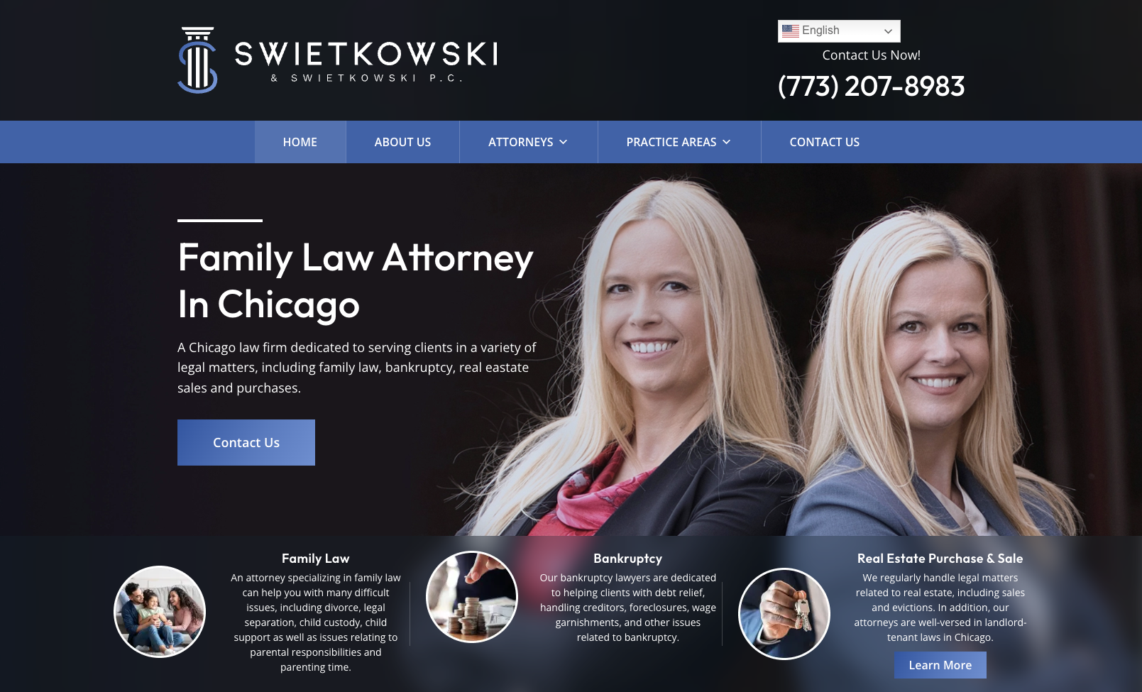
Swietkowski & Swietkowski P.C.
The web design of Swietkowski & Swietkowski has a good light theme, creating a visually pleasing and inviting atmosphere for users to navigate. Straightforward and focused on search engine optimization (SEO), this website’s “Contact Us” button makes it a prime source of leads.
Kraayeveld Family Law
The Kraayeveld Family Law website design has a high-contrast color theme and an emotionally-charged headline. The website layout is well-designed, ensuring a smooth scroll experience and allowing visitors to browse through the content effortlessly, including its phone number and practice areas.

New York Family Law Group
The New York Family Law Group’s website has an old-school style design, giving it a nostalgic feel. The personalized color selection adds a unique touch to the overall aesthetic.

Stange Law Firm
The Stange Law Firm attorney website has several calls to action but keeps it all organized. The “How It Works” section is informative and pleasant, providing valuable information that helps with legal marketing efforts.

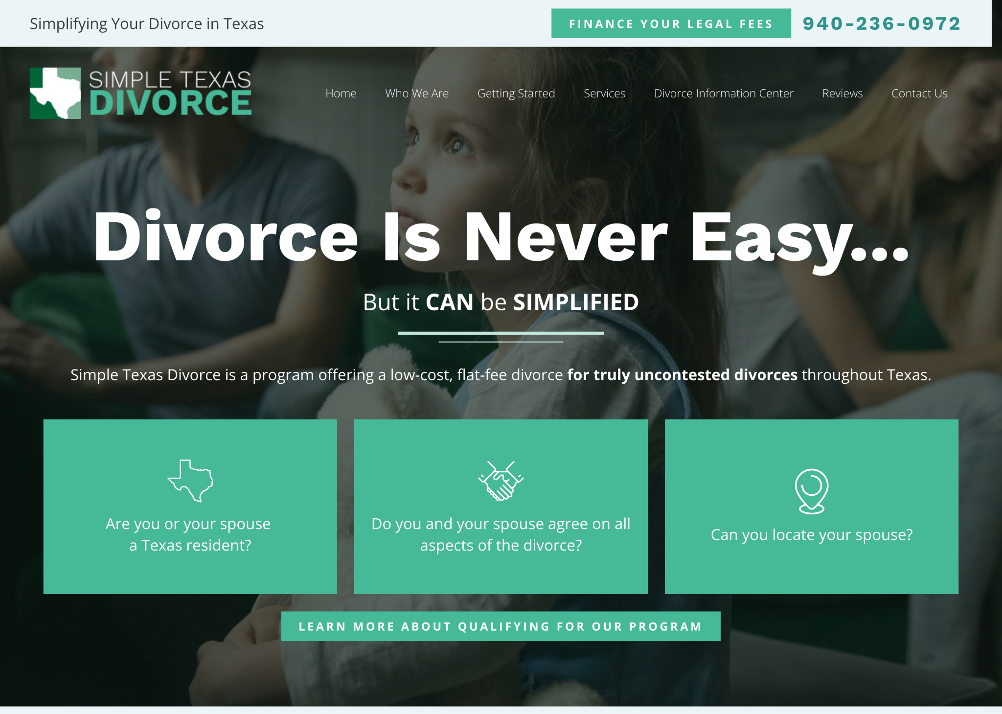
Simple Texas Divorce
Simple Texas Divorce uses an interesting color theme, clear copywriting, and pleasant background photos. The hero background video on the website is entertaining and positive, capturing the visitors’ attention. The visually attractive display of locations is also well-defined.
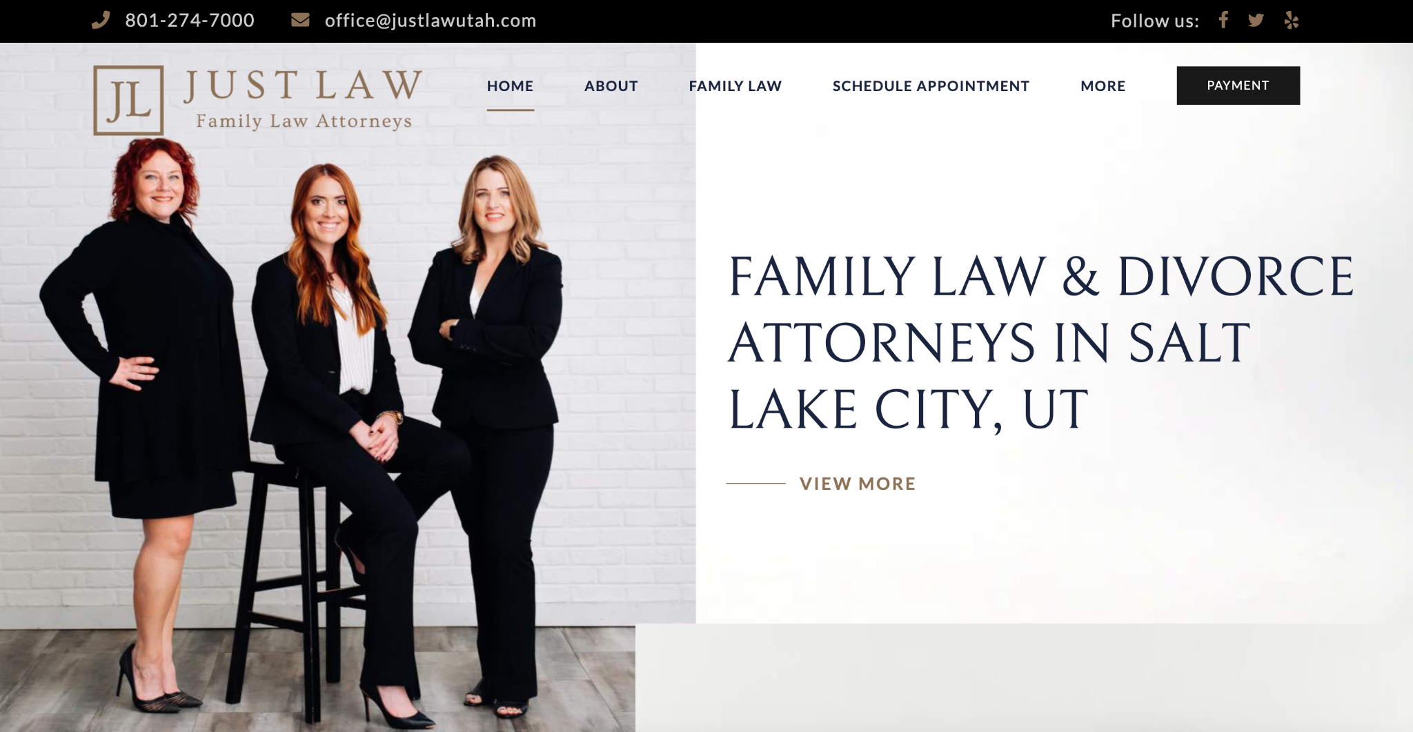
Just Law Utah
Utah-based family law firm Just Law chose a black and white theme for their website, keeping it simple but elegant. The website features a welcoming and feminine color scheme, which creates a warm and inviting atmosphere.
McMichen, Cinami & Demps
The law offices of McMichen, Cinami & Demps establish their online presence with a website design that makes great use of animation to engage first-time visitors. The stock photos are of excellent quality, and the modern layout and spacing make it one of the best law firm websites visually.

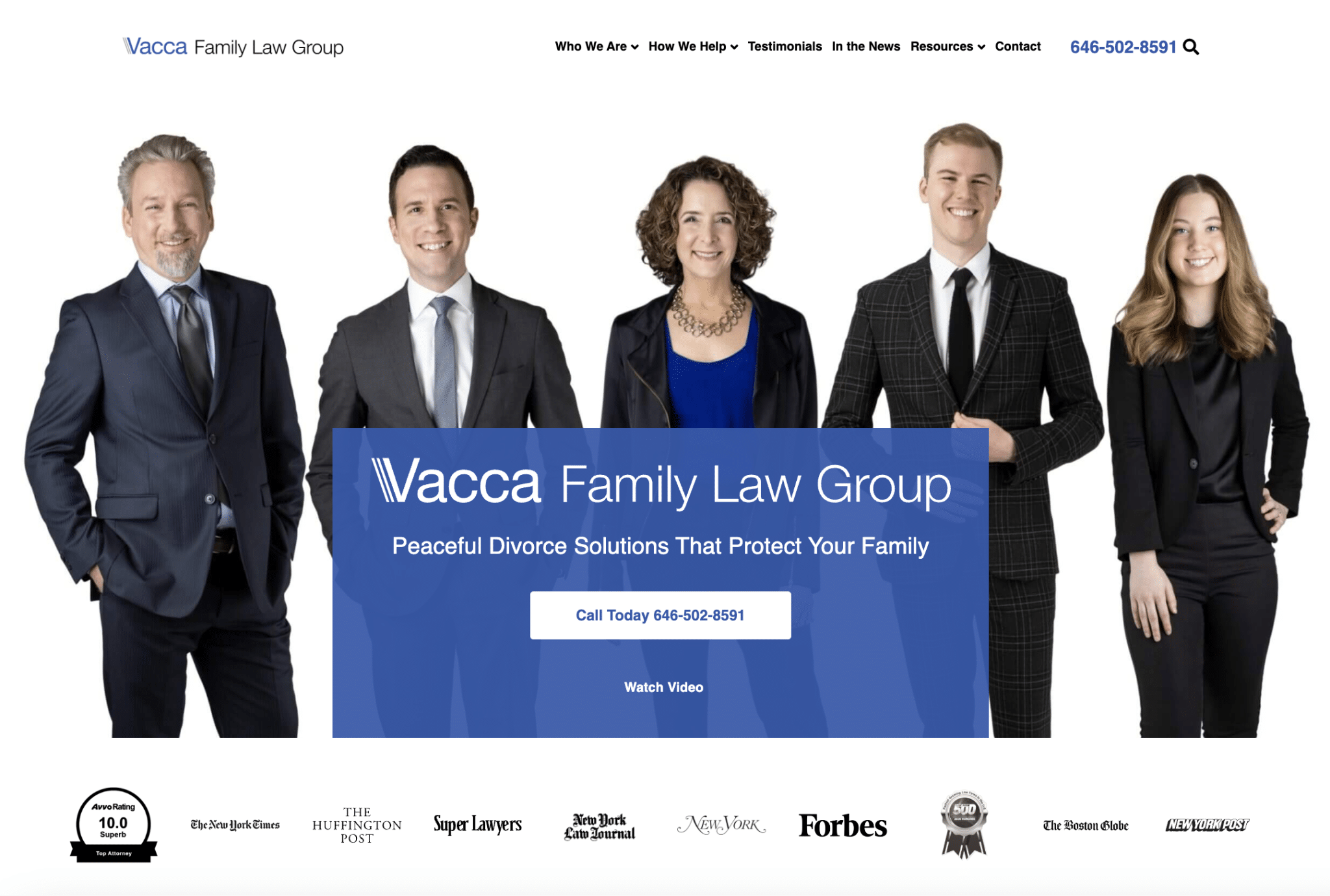
Vacca Family Law Group
New York-based family law firm Vacca Family Law Group’s website design features well-integrated background photos contributing to its visual appeal. The homepage layout is easy to view and understand, enhancing the user experience.
Krasner Law
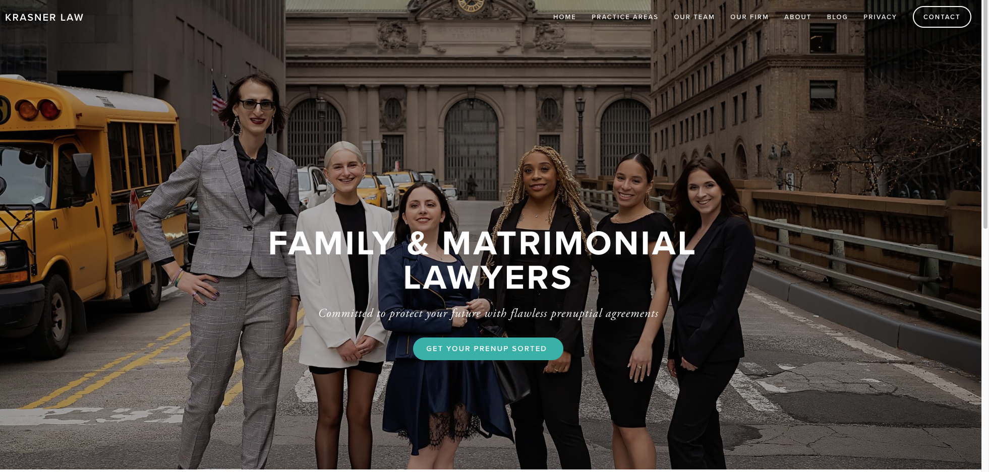
Krasner Law defines its brand with an edgy, vibrant group photo of its legal team, a well-written headline that describes its legal services, and a clear call to action.
Karp & Weiss
The family law firm Karp & Weiss follows a standard color scheme, and it creatively integrates the logo as a decoration below the titles, adding visual interest. The content is well-sectioned, making it easy for website visitors and potential clients to navigate and find the information they need.

Thompson Family Law Firm
The Thompson Family Law Firm’s website has a simple yet easily perceivable design, allowing website visitors to quickly understand its purpose and navigate through the content without confusion.

Boler Law
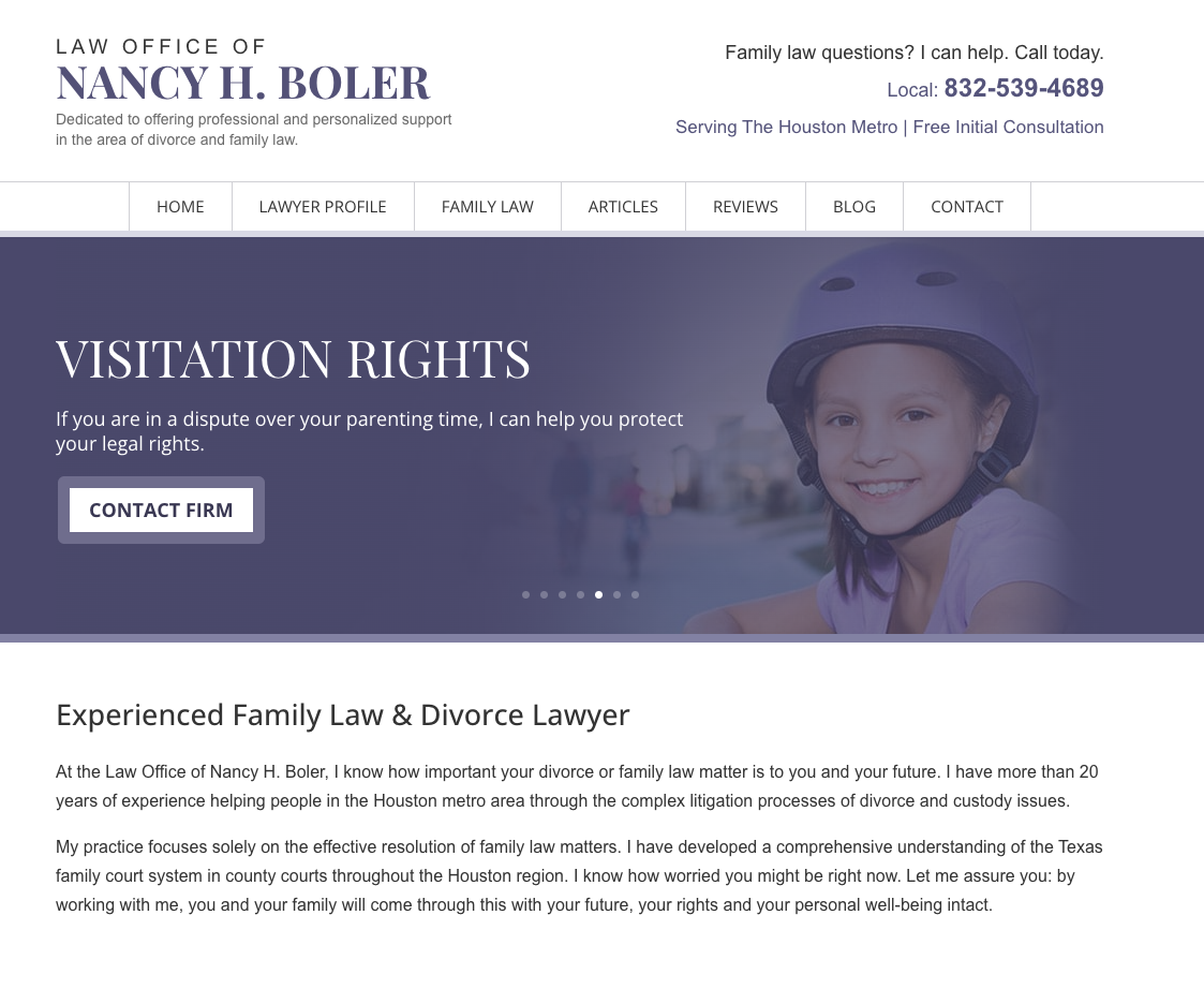
Family lawyer Nancy H. Boler’s law firm website has a simple and bold design, making it easy for users to navigate and find the desired information. All calls to action are in place, although some of the visual stylings can be enhanced.
Elise Buie Family Law
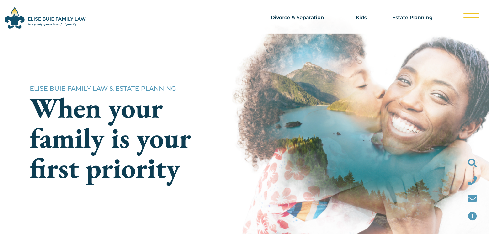
The web design of Elise Buie Family Law features creative media elements that enhance the user experience. The images are a pleasure to view and follow, ensuring an engaging browsing experience for its target audience.
Divorce Done Right
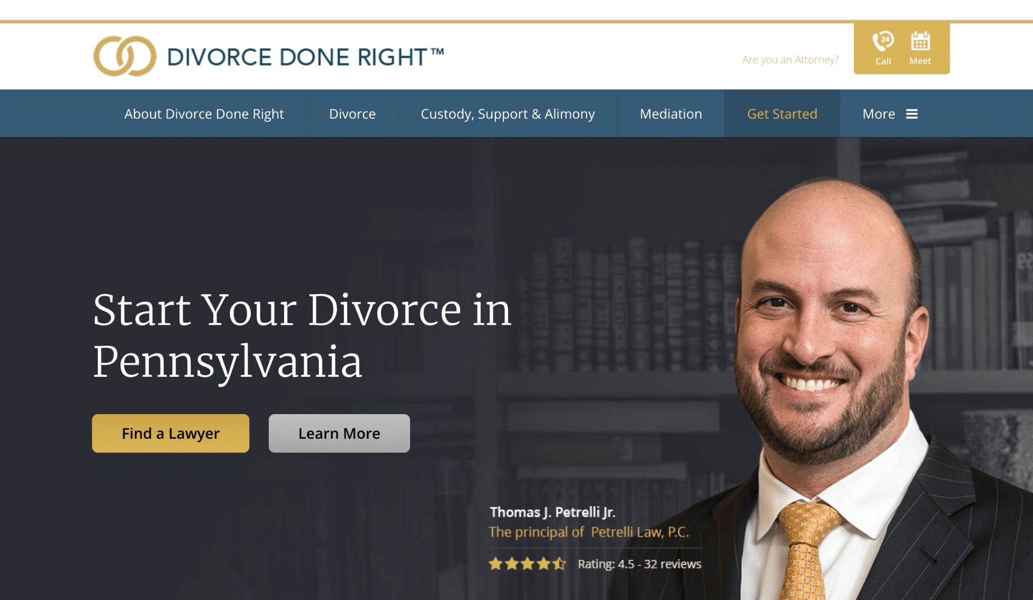
Divorce Done Right’s website design is done well, particularly in the “Get in Touch Today!” section, which creates visual appeal and a professional impression. The map with locations extends the interlinking of the site’s content, providing additional value to website visitors and prospective clients.
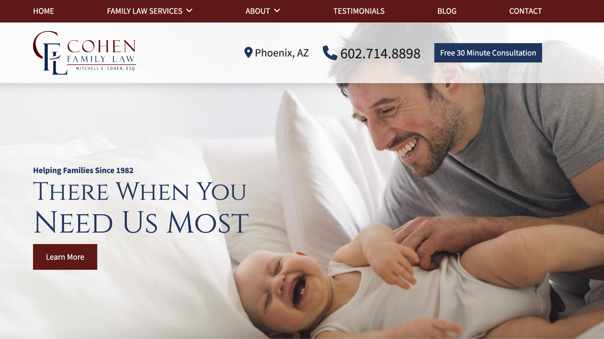
Cohen Family Law
The Cohen Family Law web design incorporates captivating animations that contribute to a dynamic user experience. The content is well-structured, allowing visitors to quickly find the information they seek.
Burnham Law
The website for family law firm Burnham Law boasts a modern and stylish design, potentially ranking as the second-best lawyer website from the list. It achieves a great balance of CTAs, media, and content, creating a visually pleasing and user-friendly experience.

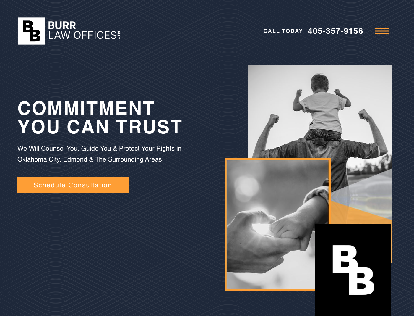
Burr Law Offices
Burr Law’s website incorporates sophisticated design elements, such as background texture and image style, which add a touch of elegance.
Hargrave Family Law
Hargrave Family Law uses compelling copy and heart-warming visuals to capture attention and engage prospective clients. While there are many elements within the web design, everything is a great balance of aesthetics and functionality.

NMSB Law
The website’s style for NMSB Law falls somewhere between old-school and modern, combining elements from both aesthetics. This blend creates a unique and interesting design that can appeal to many users.

Guymon Law
Guymon Law’s website presents a modern look with well-structured practice areas, providing visitors with clear and organized information. The incorporation of decorative elements and a balanced color scheme enhances the visual appeal of the site.

Family Law Websites With Areas for Improvement
Here are some websites that look great but have areas for improvement regarding layout and visual value.
Kaufman Steinberg
Kaufman Steinberg’s family lawyer website design has a prominent form that is too extensive, blocking the view of other elements on the website. One way to resolve this is to highlight only priority practice areas to avoid overwhelming website visitors.

Nevada Family Law Group
The web design for the Nevada Family Law Group is overall attractive, but there color theme’s contrast is too high, which can strain the eyes and make it difficult to read the text comfortably.

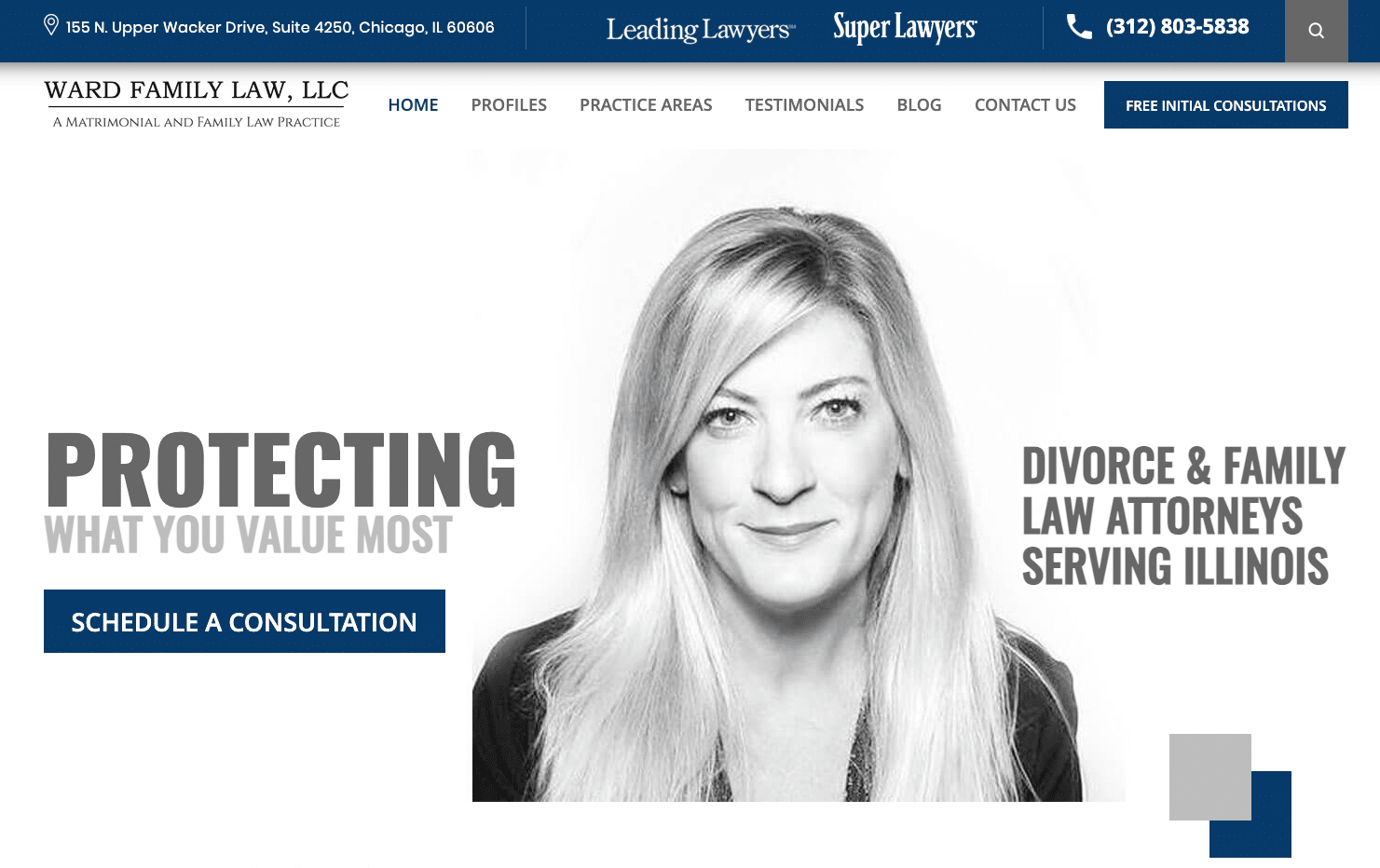
Ward Family Law
The Ward Family Law website has a simple design, but the contact form on the website is both huge and too complicated, which may discourage potential clients from reaching out or providing their contact information.
The Lincoln Law Firm
The bold hero section of the Lincoln Law Firm’s website stands out positively. However, the theme lacks accessibility, as it incorporates depressing stock photos that may not resonate well with its target audience.

Prager Jones
The Prager Jones website looks great at first look. The mobile version of the website features an interesting choice of quick navigation, but the title fonts are hard to read, causing potential readability issues.

Truce Law
The website for Truce Law has the potential to grab and engage its audience, the logo can be improved. The business photos are excellent and convey professionalism. The thoughtful styling of the services block makes up for the rather small font size.

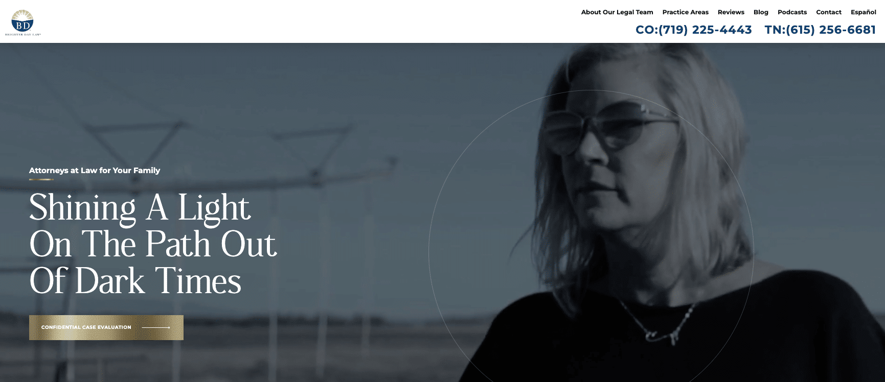
Brighter Day Law
Brighter Day Law has a beautiful web design and customized sections, but the text line height is too small, making it challenging to read. Additionally, the chosen shadow style might not be the best choice for the overall design.
Sarah Carmody Law
Sarah Carmody’s web design looks great, but there are some elements that can be improved for a better user experience. The buttons on the website can be hard to read, and the fonts used are too narrow. Although the calls to action are visible, the unusual block layout fails to provide easy navigation.

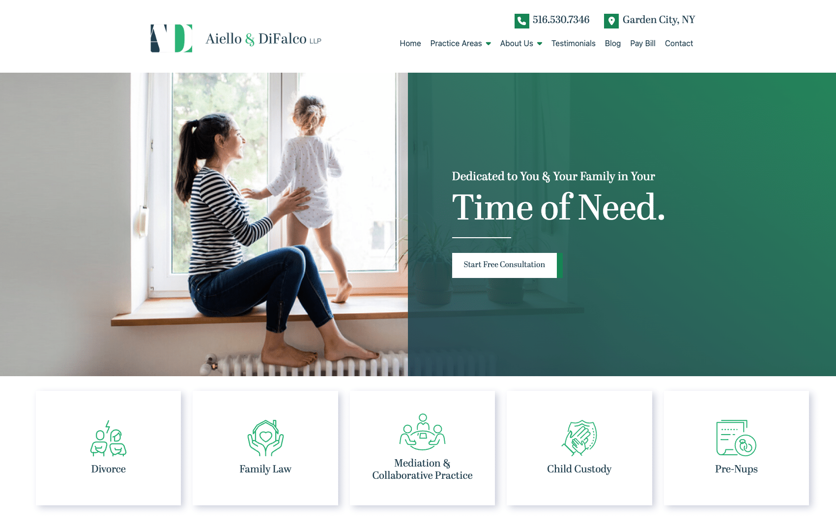
Aiello and DiFalco LLP
The hero design for Aiello and DiFalco’s website is good and clean, but the succeeding sections seem to be stacked together without presenting the firm’s value effectively, which might help win over potential clients.
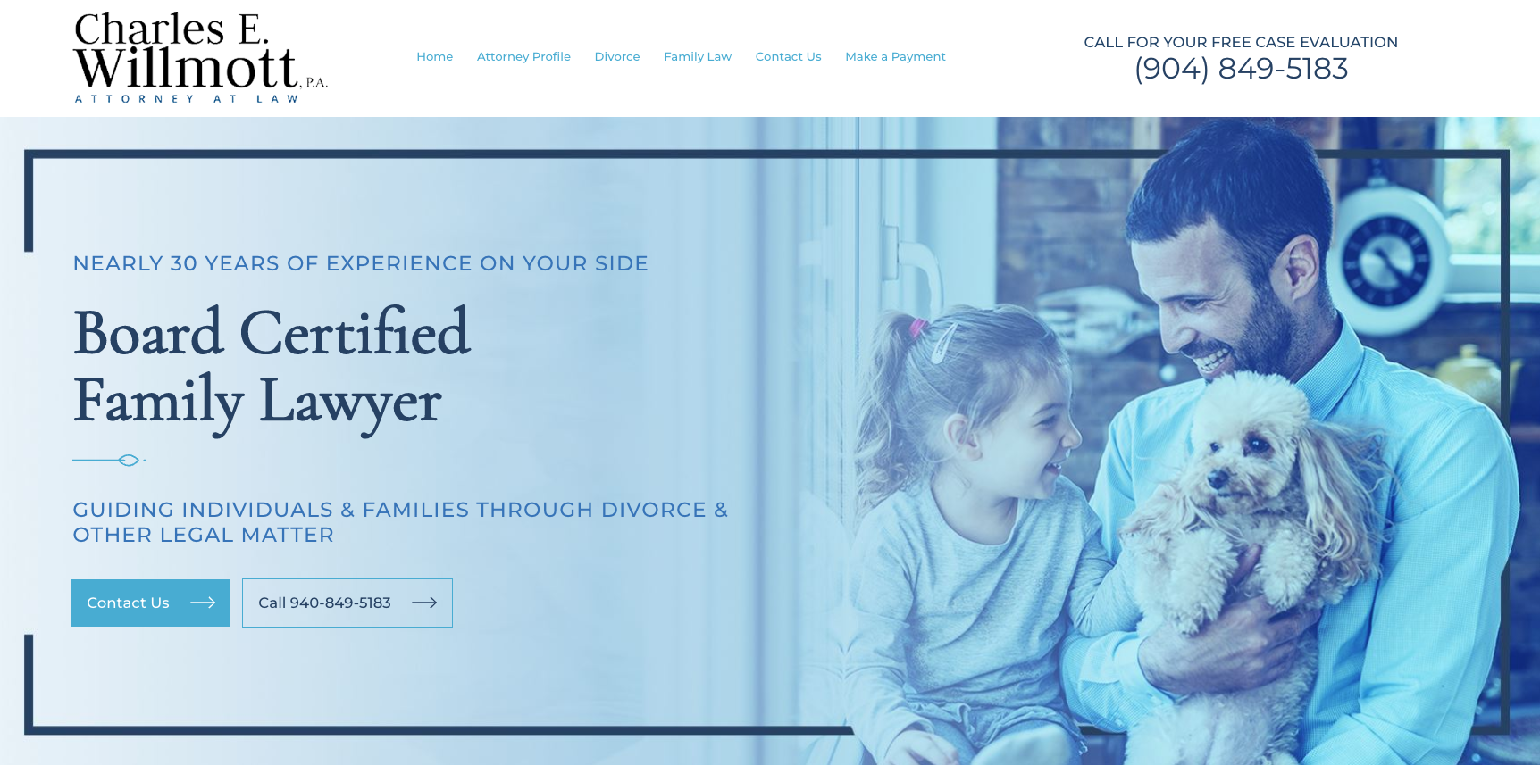
Charles E. Willmott
The Charles E. Willmott family lawyer website features an exciting choice of style and decorative elements. There are visible image size problems, and it seems that some content has been added solely for SEO purposes, rather than focusing on high-quality, persuasive content.
Cedeño Law Group
The website design for Cedeño Law Group is great for highlighting their practice areas and free consultation. Some areas for improvement include improving the color scheme and fonts to improve user readability.

Heather Robertson Law
The Heather Robertson Law website does a great job of highlighting its practice area (estate planning). From a visual point of view, the design feels a bit incoherent, which can be fixed by selecting better fonts that fit the overall layout.
Rudyuk Law Firm
The Rudyuk Law Firm website demonstrates how to build trust with target audiences with a professional headshot and trust badges. On the other hand, the bright colors can be visually overwhelming as with the huge headers.

Jeffrey Law
Jeffrey Law’s website features interesting icon animations and a well-structured layout. However, the color scheme might be a bit too dark, which could affect the overall readability.

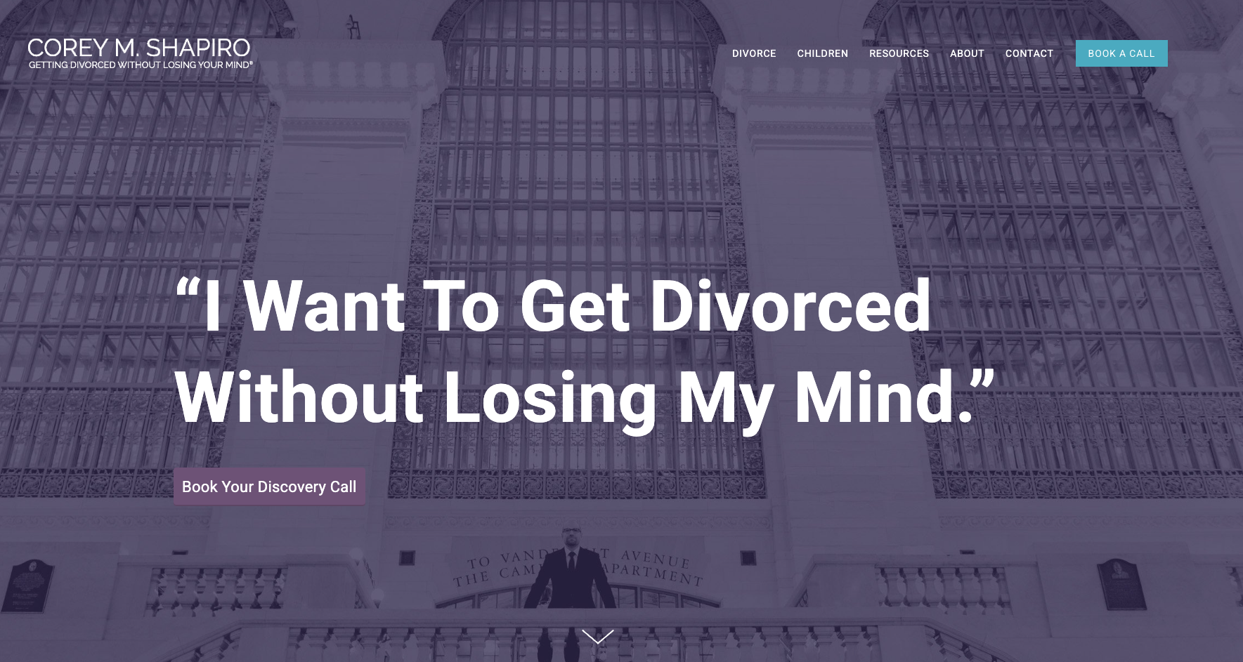
Corey M. Shapiro
Corey M. Shapiro’s site is attractive and makes a good first impression, but it can be improved by having a coherent visual theme. The sections have varying appearances, confusing website visitors and taking away from a central call to action.
Divorce Simplified
The attorney web design for Divorce Simplified is plain yet welcoming. However, the white space could benefit from adjustments to ensure a better balance of great user experience and overall visual harmony.

Butler, Guirado, and Meister PC
The family lawyer website for Butler, Guirado & Meister features an entertaining video hero that captures visitors’ attention. When it comes to functionality, the website layout might be too wide, and website visitors would need to scroll horizontally. Additionally, the homepage might be overly long, affecting engagement.

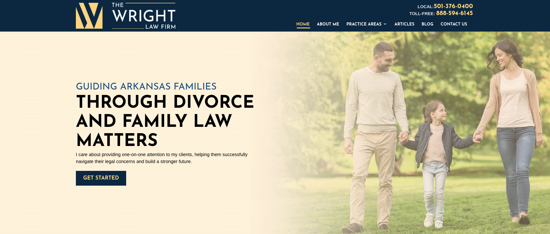
The Wright Law Firm
The Wright Law Firm’s website has a good color balance, creating a visually appealing appearance. The footer area can be improved by making its appearance match the rest of the site.
Duncan Family Law
The website design for Duncan Family Law is off to a great start. It would benefit from optimization for mobile devices, as some sections on the desktop version do not translate well to smaller screens. Improving the mobile version would enhance usability and the overall user experience.
Carolyn M. Bone
The homepage of Carolyn M. Bone‘s website has a fresh and modern color scheme. However, the layout and content are basic and can do with more personality and uniqueness. Adding more distinct elements could help make it more memorable.

Goranson Bain Ausley
The Goranson Bain Ausley family law firm uses a unique website design with strong graphics, but the copy and call-to-action can be improved to win over potential clients.

Create Your Custom Family Law Website Today
Building a family law firm website can be a long and tedious process, but with a clear vision of what you want to achieve, it can be done.
Most lawyers are not experienced with law firm website design, so it is usually outsourced to experts. Hiring a digital marketing agency that specializes in law firm website design is a common solution.
Are you ready to build the best website design for your family law firm? Get in touch with us, and we’ll help you from start to finish.
Table of Contents
Related Articles
Dominate Your Market with Digital Marketing Services That Deliver
Talk to a certified professional today, and we will design a strategy specific to your case.


