22 Best Criminal Defense Lawyer Websites (And 5 That Could Do Better…)
Criminal defense is a competitive practice area. To make a strong first impression, your firm needs to get its lawyer website’s design right.
However most criminal defense websites look alike. So today, based on user experience, copy, and overall design, we want to share a carefully curated list of 22 best criminal defense websites.
Browse this list to find the inspiration for your law firm’s website.
22 Criminal Defense Lawyer Websites For Inspiration
Wilshire Law Firm
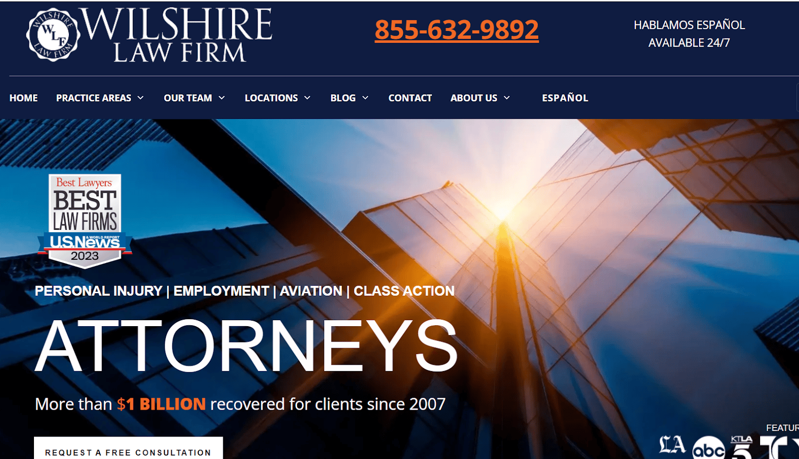
The Wilshire Law Firm website is a prime example of a criminal defense website done right. The sleek and stylish design immediately catches the eye, making it easier to navigate and find the information you need. The clear and concise content is easy to read and understand and helps prospects make an informed decision about their legal representation.
Plus, the high-quality images, attorney bio, and case results showcase the credibility of the criminal defense law firm, demonstrating its commitment to providing top-notch legal services.
The Law Offices of Jeffrey Lichtman
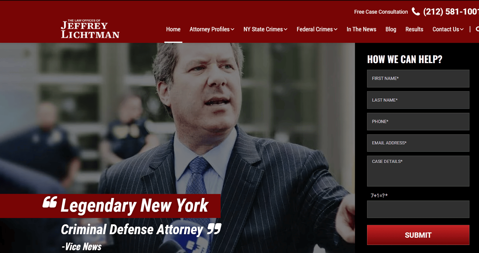
From the moment you land on this criminal defense law firm’s website, you’ll notice that it’s dedicated to providing a great user experience.
They show their expertise through testimonials from authoritative sources and a focus on the practice area. The website’s hero image displays the face of the criminal defense law firm and its commitment to high-quality services. Plus, it features real-time images, uses targeted content, and has a clear call to action to encourage visitors to take action.
Chicago Criminal Defense & DUI Attorney

The Chicago Criminal Defense & DUI Attorney website features a prominent rating, a clear color scheme, and jargon-free content for easy navigation. It showcases case results and includes a video message to connect with web visitors. They provide comprehensive information to help prospects make informed decisions about their legal representation.
National Association of Criminal Defense Lawyers

The National Association of Criminal Defense Lawyers is a directory of criminal defense attorneys that delivers its message through minimal content and high-quality pictures. The website uses images to effectively demonstrate its message, providing visitors with a clear understanding of the type of cases the lawyers listed there handle.
The focus is helping prospects connect instantly with the right lawyer for their case. Additionally, they provide resources for anyone seeking representation in criminal defense cases.
Crawford Law – Pensacola

Crawford Law – Pensacola’s website features a sleek design and good animation to enhance the user experience. The home page showcases logos, awards, accolades, and case results to build credibility. The copy is written from the prospects’ point of view, making it easy to understand their message and connect with them.
The site also includes clear call-to-actions repeated multiple times to help the web visitors confidently take action.
Carlos Gonzalez Law
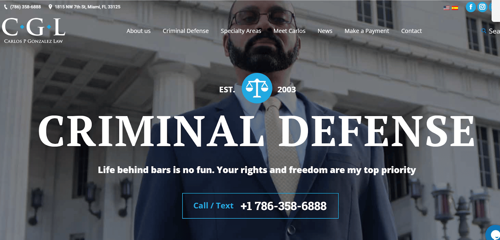
Carlos Gonzalez Law is a criminal defense law firm that has narrowed its focus to specific practice areas, clearly defined based on the type of charges a client might face.
The website’s copy is client-centric, addressing the client’s pain points and clearly describing who they help.
The clarity in the website’s copy makes it easy to understand, and the clear call to action, repeated multiple times, gives visitors the confidence they need to take action. Carlos Gonzalez Law is a reliable resource for anyone seeking representation in criminal defense cases.
Kohlmeyer Hagen

Kohlmeyer Hagen’s website features a good color choice that makes the text pop against the background. They provide in-depth information on the firm’s practice areas, outlining what clients can expect and who they are.
To build credibility, attorney bios are readily available on the home page, along with client testimonials and the Google rating.
Plus, the website’s clear call to action is highlighted with a red form that pops up against the dark background, drawing visitors’ attention to it.
Criminal Defense & Personal Injury Lawyers

This criminal defense law firm’s website speaks directly to its target audience, using easy-to-understand language. The site provides in-depth information on criminal defense practice areas, including a live chat feature for immediate assistance.
Besides that, they feature trial videos, news coverage, and separate web pages for each attorney, reviews, and results, making it easy for visitors to find what they’re looking for.
Joslyn Law Firm

Joslyn Law Firm’s website is designed to engage visitors with an eye-catching video. The firm showcases its credibility on the front page, displaying its Google and Avvo ratings, awards, and client reviews.
The web visitors can learn about the law firm’s team of lawyers with their profiles featured prominently on the site. The website aims for clarity in its content, making it easier for the prospects to understand the services offered and make an informed decision.
Rishi Gill

Rishi Gill’s website uses storytelling in its web copy to connect with the visitors and build trust with them. Plus, they’ve displayed testimonials from satisfied clients on the front page, highlighting the firm’s commitment to delivering results.
Even though the design is basic, they focus on engaging visitors through content and building a personal connection. The firm offers 24-hour service, demonstrating its dedication to serving clients in their time of need.
Knutson+Casey
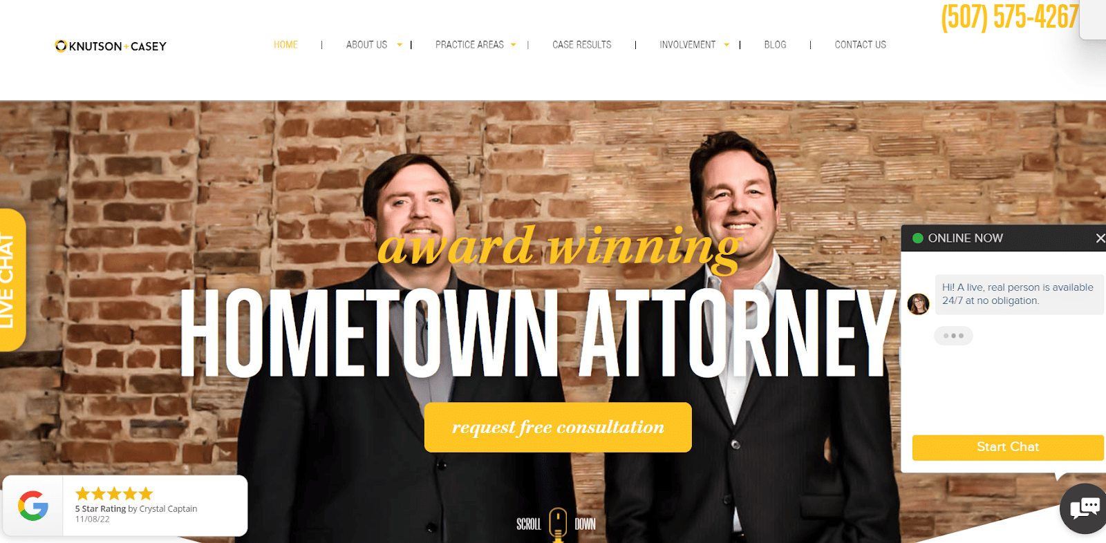
Knutson+Casey’s website showcases a visually appealing and interactive design, highlighting the firm’s accomplishments and experience. The site boasts the total amount earned for clients, and they position themselves as “hometown attorneys,” creating a sense of familiarity with their target audience.
Customer testimonials are displayed to reinforce the firm’s credibility and expertise further.
San Antonio DWI Lawyer

San Antonio DWI Lawyer have taken a focused approach to their website. They’re explicitly serving those facing driving while intoxicated charges.
The website showcases real numbers and speaks directly to the prospects, offering clarity in both design and copy. Using YouTube videos, they aim to build trust with the audience and establish themselves as subject matter experts.
Roulston Urquhart Criminal Defence
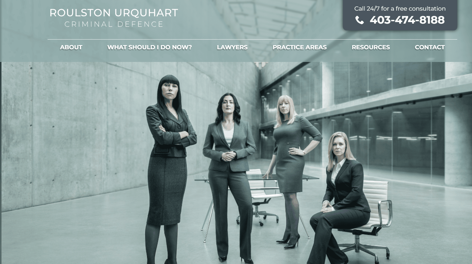
Roulston Urquhart Criminal Defence has a simple website design with a clear copy that explains its process and practice areas in detail. They use content marketing to build trust with their audience and establish themselves as experts in their field.
MayesTelles PLLC

MayesTelles PLLC’s website features a clear call-to-action and minimal design with a dark background that makes the text pop. It showcases their won cases and offers several unique selling points to differentiate them from their competitors.
The website design is eye-catching and clearly and concisely presents information.
Oykhman Criminal Defence Lawyers Calgary
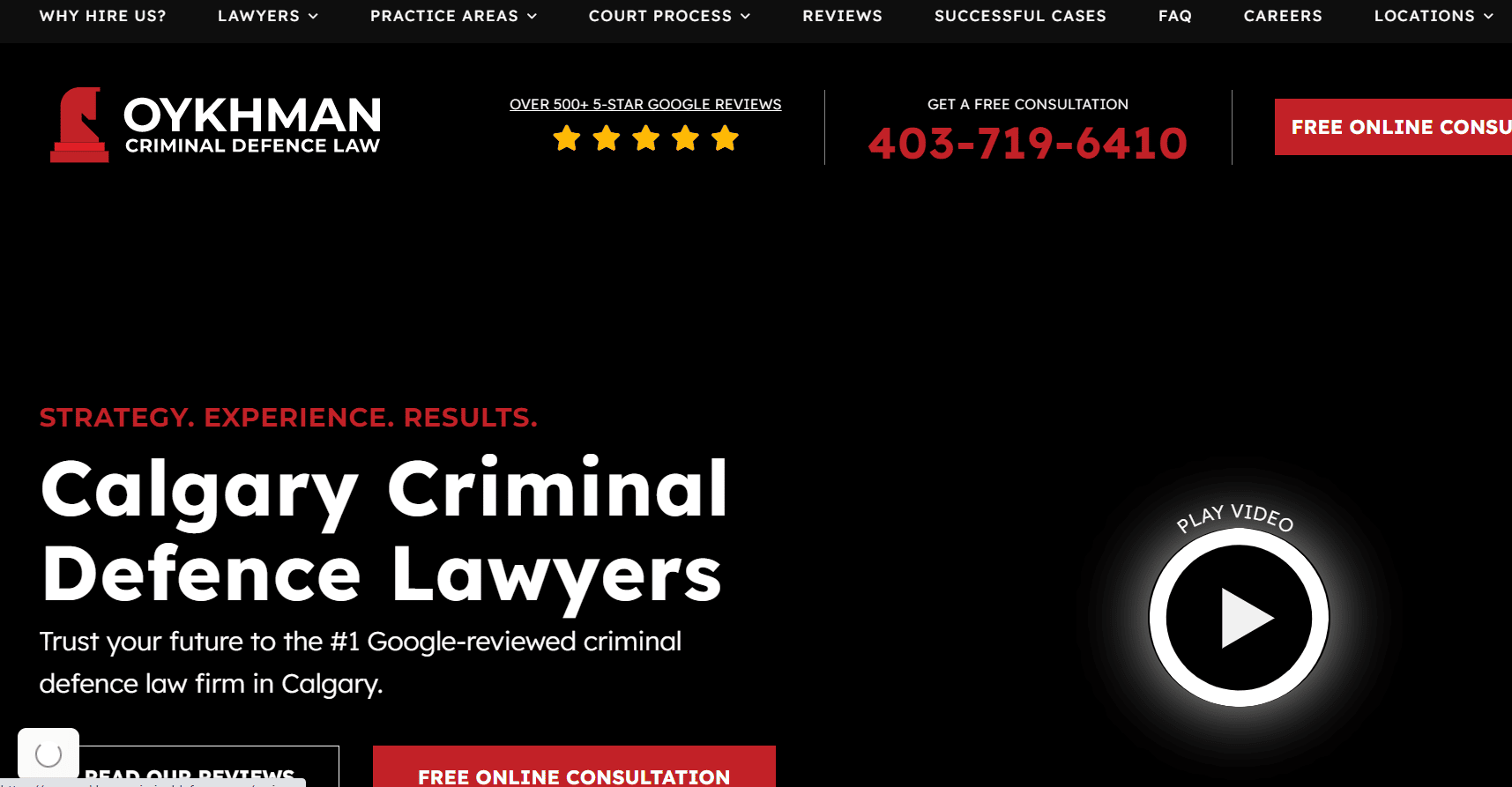
The firm offers free online consultation and is committed to delivering clear and concise information.
Davis Law Group
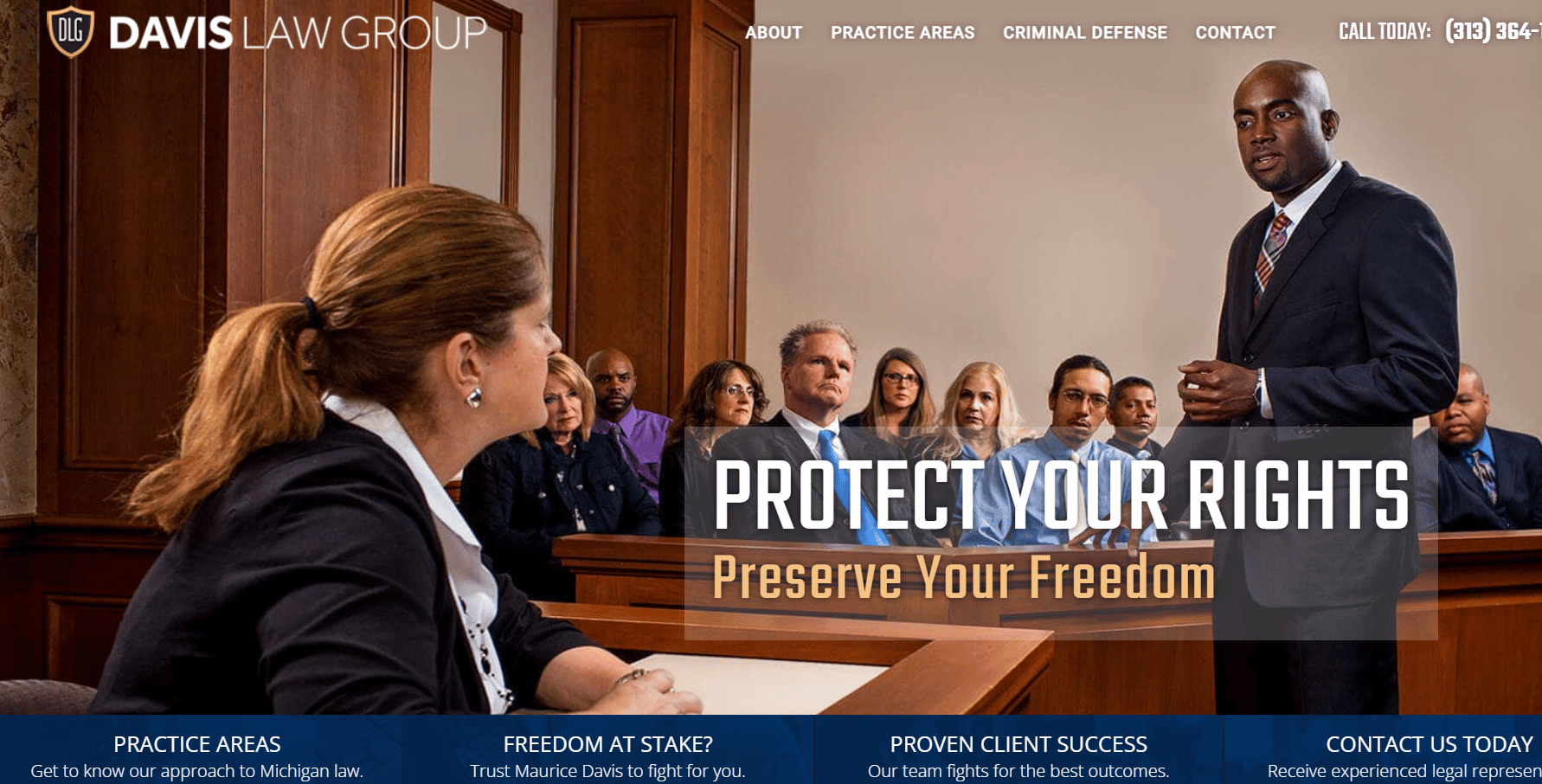
The Davis Law Group’s website defines its purpose and approach of helping its clients. The website is user-friendly, and the copy speaks directly to the audience’s pain points, emphasizing their legal issues’ importance and their impact on their future.
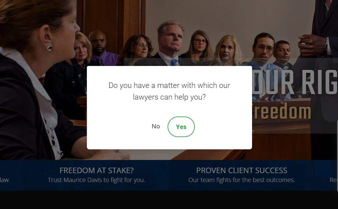
They encourage the web visitors to stay on the law firm site for longer through their resonate exit intent popup copy.
Besides that, they highlight their recent case results to build trust and convince their prospects to take action.
Attorney Paul Gipson

The website of Attorney Paul Gipson features a simple and basic design, perfect for solo practitioners. The website showcases a personalized testimonial, highlighting the criminal defense attorney’s easygoing personality and building credibility with prospects. The website can serve as inspiration for those looking to create their website on their own.
The Rodriguez Law Group

The Rodriguez Law Group website displays its credibility by featuring news articles where its firm has been mentioned. They offer a toll-free number for customers’ convenience. Plus, they display their Avvo ratings and Google My Business reviews to build credibility and showcases recent case results to demonstrate their effectiveness.
Tritico Rainey, PLLC
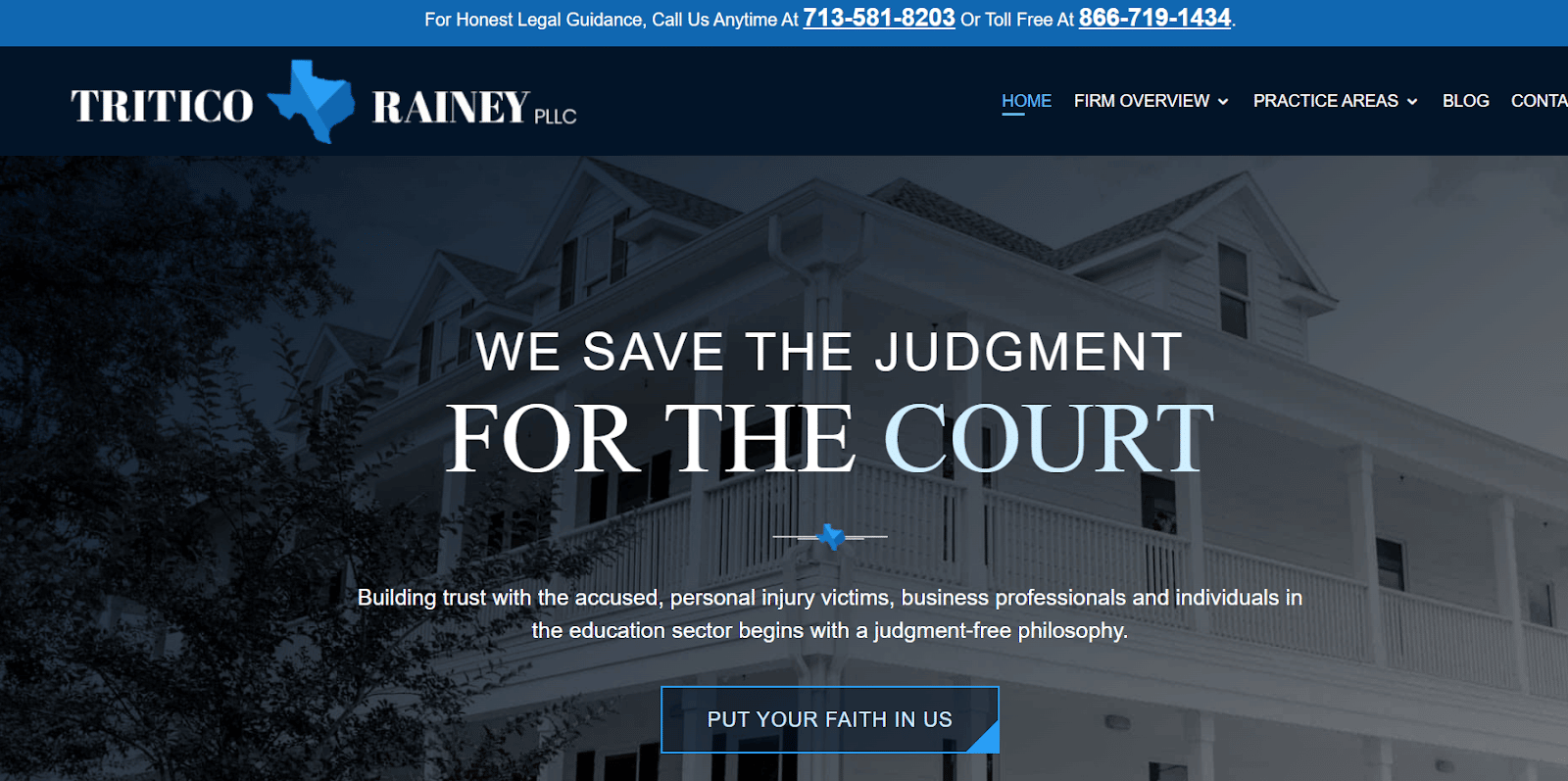
Tritico Rainey, PLLC is a criminal defense law firm that prioritizes helping clients, not judging them. With a clear message and 75 years of experience, they aim to build credibility.
They showcase their experience on their website and have a review us button for clients to share their experiences. Their approach is focused on helping clients, making them a trustworthy option for legal services.
Law Offices of Richard C. McConathy
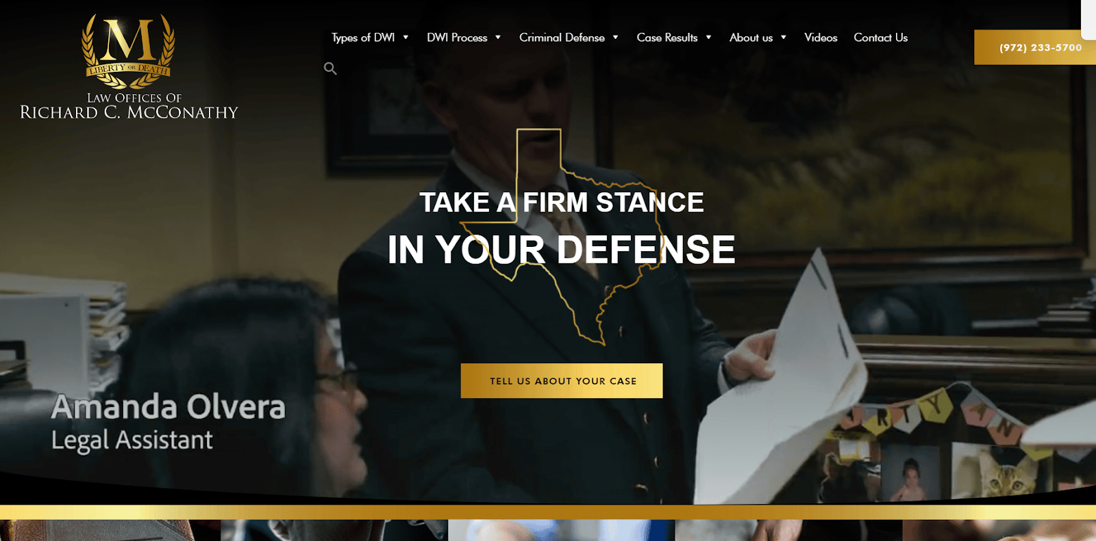
The Law Offices of Richard C. McConathy features a classic website design with an interactive hero and showcases case results with high-quality visual media. The 35-year-old criminal defense law firm gains credibility by highlighting its experience, the number of cases dismissed in different niches, and the number of countries served.
Broden & Mickelsen, LLP

Broden & Mickelsen, LLP is a criminal defense law firm with a minimal design approach. They showcase their expertise by highlighting the types of cases they’ve won, including murder, child sexual assault, mail and wire fraud, and drug charges.
The website includes images of the attorneys, so prospects know who they will be working with. The firm’s process and practice areas are described in detail, helping prospects understand their approach and services.
DDSG Criminal Law
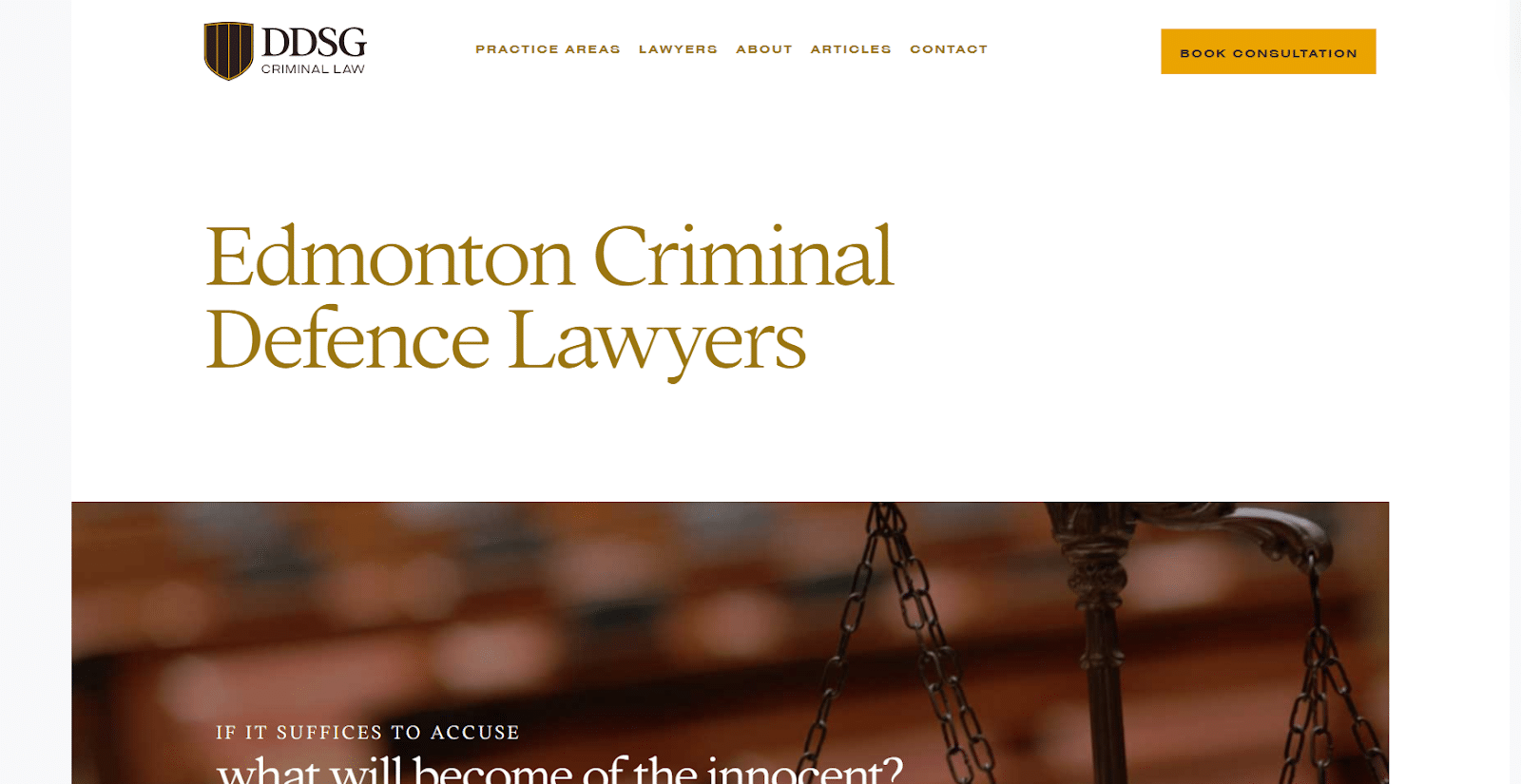
DDSG Criminal Law offers a simple yet effective website design, targeting clients’ emotions with their copy. They clearly describe their services and the consequences of different criminal cases.
The website features a fixed header with a clear call-to-action button. It improves the conversion rate as the prospects can click on it the moment they decide to take action despite what part of the page they are on.
5 DUI That Can Do Better With Their Website’s Design
Berry Law
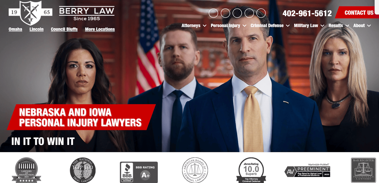
To start with, the website design has no clear call to action on the hero image. Preferably, when someone opens your website, their eyes follow the text, and their first instinct is to scroll down. So, a CTA on the Hero header after the text would be a good addition.
Besides that, the USP can also be refocused to be more client-centric, emphasizing what prospects will get from the firm.
Bachner & Associates, PC

For Bachner & Associates, PC, adding a clear and easy-to-use call to action can improve their conversions considerably. This could be a direct call button or a link to schedule a consultation to get in touch with them instead of having them copy and dial the cell number shown.
Remember, the golden rule is to make it as easy for prospects to take action as possible.
Criminal Defense Lawyer
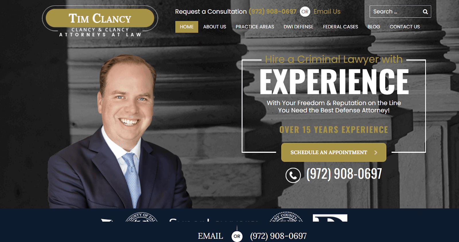
Criminal Defense Lawyer is good, but they can simplify their overall look to reduce clutter and improve the user experience.
For instance, instead of giving three CTAs at once, just provide them with one and reduce distractions.
Fort Worth Criminal Defense Attorney
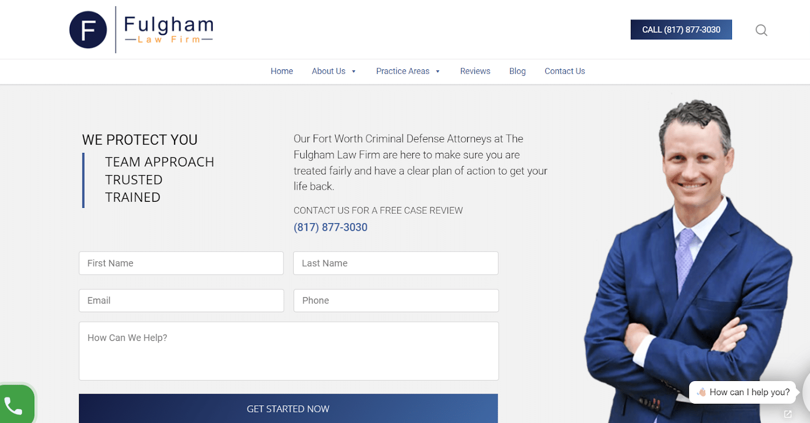
Fort Worth Criminal Defense Attorney has a basic design, which is fine. Still, more focused headlines and content speaking directly to their target audience can enhance how prospects interact with the website.
Besides that, they have information hidden behind buttons at various places, which can make a good impact on the audience if made accessible easily.
The goal is always to provide a good user experience — and your website should reflect that.
Grant Dwyer Law
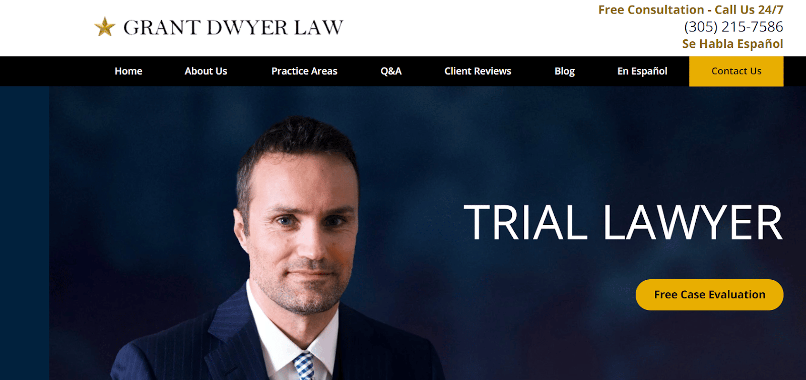
This website gives no reason for web visitors to look around. It has no hook in the hero header, you have to scroll down to see client reviews, and they start with speaking about themselves.
The primary purpose of the website of criminal defense law firms is to show your credibility, connect with your audience, and encourage them to choose you over your competitors. It’s not your basic profile, where you mention who you are, where you’re from, and what you do. It’s always about your audience, not you.
Ready to Build a Client-Centric Criminal Defense Law Firm Website?
The criminal defense lawyer websites we mentioned offer a great range of features, including professional designs, effective calls-to-action, informative content, and easy-to-use contact forms. You can use them for inspiration as your primary goal remains to get your prospects to take action.
Want more inspiration? Checkout our client’s Las Vegas criminal defense lawyer website or continue reading our list of best attorney websites. Want our team to design a professional website for your brand? Contact us today for a free consultation.
Table of Contents
Related Articles
Dominate Your Market with Digital Marketing Services That Deliver
Talk to a certified professional today, and we will design a strategy specific to your case.


