16 Best Personal Injury Law Firm Websites: 2025 Edition
Personal injury marketing is challenging because of insanely high competition. Most personal injury attorneys struggle to get leads or clients. A robust law firm website is the first step to making a solid impression on prospects. It also serves as the home base for your digital marketing efforts.
This article will look at the 15 best personal injury law firm websites in 2025, with a key takeaway from each one. Similar to our compilation of the best attorney websites, the list below has significant contributions from Janis Rubulus, our design lead, and Kaspars Milbergs, our CTO. Let’s get started!
Note: We have over a decade of experience in building websites. Specifically, we have designed 300+ attorney websites in the last decade, offering law firm website design services. Contact us today for a free quote for developing your firm’s website!
Meyers Injury Law

Our homegrown injury website, Meyers has a conversion-focused and clean design. It uses shades of blue as the brand color and draws attention toward Chadwick D.G. Meyers, the owner of the firm. Its homepage lays down what the firm focuses on, lays down the practice areas of the firm linking to specific pages like this one on car accidents, establishes their USP and displays some social proof—all while prompting the reader to get a consultation with the firm.
All in all, Meyers is a great example of how to create a user friendly website that incorporates your branding and takes SEO in account.
Key Takeaway: It’s possible to ensure stellar SEO while focusing on conversions for your injury website.
Gray Law Firm
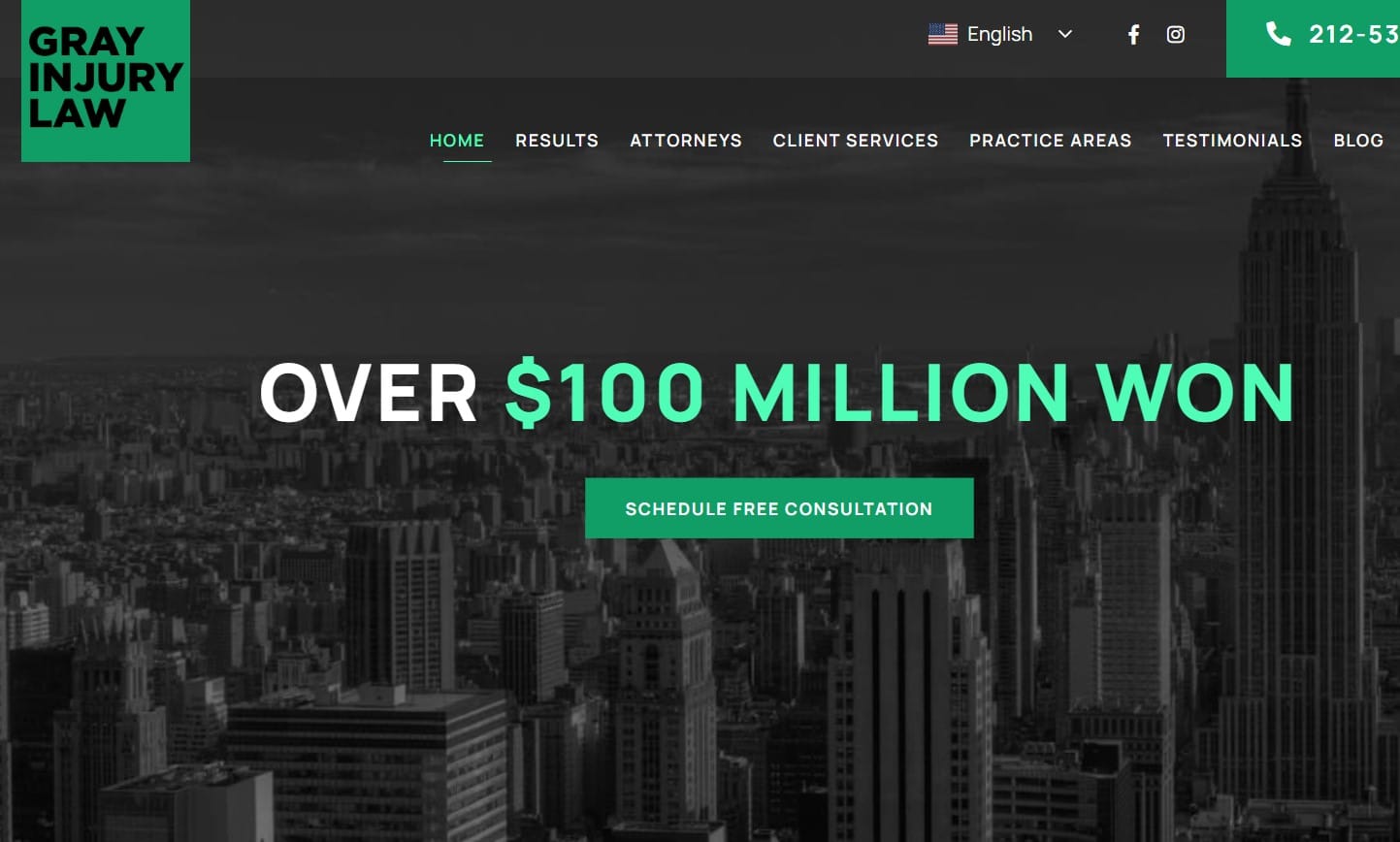
The primary thing your personal injury clients would want from you is to help them get fair compensation for the problem they have suffered due to the incident. And just by looking at Gray Injury Law’s website, you can see that they understand their target audience quite well. As a result, despite having a minimal design, they’re able to hook their prospects by showing how much they have already won for their clients.
Moreover, they stress the importance of a good negotiation in their unique selling point, “Never settle for less,” as well; hence, telling their clients that they know where their interest lies. Naturally, someone would like to work with a personal injury lawyer who understands their problems instead of someone who’s merely offering them a service.
Besides that, their site offers easy navigation, an effective call to action, pictures and bios of their attorney team, and dedicated pages for each practice area. Font size could’ve been bigger, but overall, it conveys the message.
Key Takeaway: To get the best results, understand your target audience and create your website based on that.
Rosenberg, Minc, Falkoff & Wolff, LLP
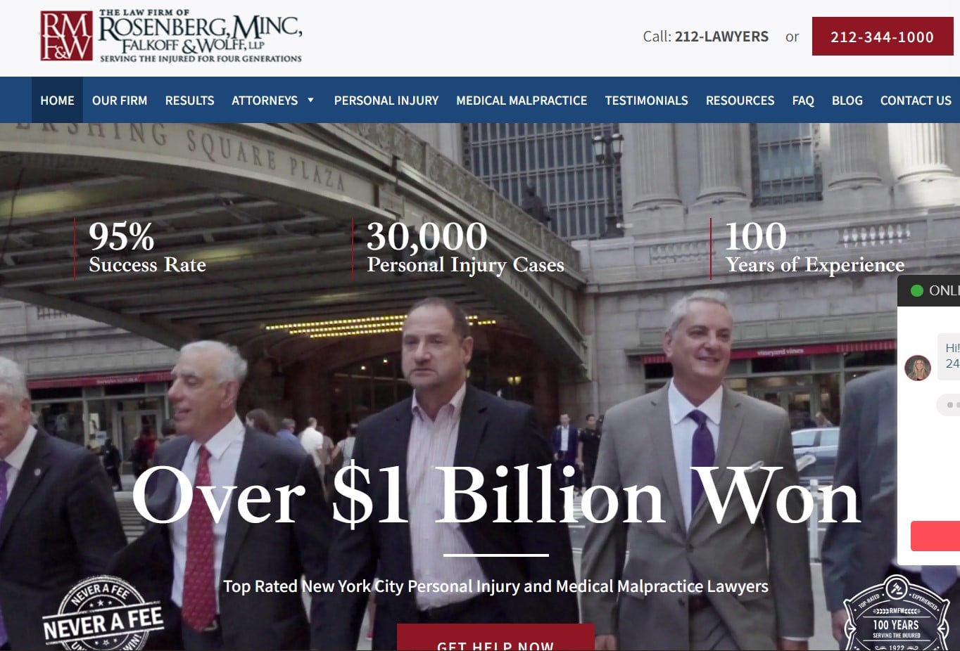
The website design of Rosenberg, Minc, Falkoff & Wolff law firm is effective as its main focus is to encourage people to take action. The color of the CTA button makes it stand out in the background, shifting the prospects’ focus towards it. Plus, they claim to take no fee until you win, another way to help people decide.
If you notice, they describe each of the cases or damages in personal injury they deal with where the potential clients may need their help. That way, all their prospects must pick the personal injury claim they want to make and click on the call to action button.
Key Takeaway: Make it super simple for your audience to take action.
Hipskind & McAninch, LLC

Hipskind & McAninch’s website hooks their web visitors with the Hero video and increases their time on the site. The website looks professional, with a good color balance and vibrant contrasts.
Most sections and content of the website are comprehensive and do not overwhelm the prospects with text. Plus, the contact information block looks good and provides essential information.
Key Takeaway: Keep the look of your website professional and choose the color contrast keeping what can make your audience click in mind.
Wattel & York
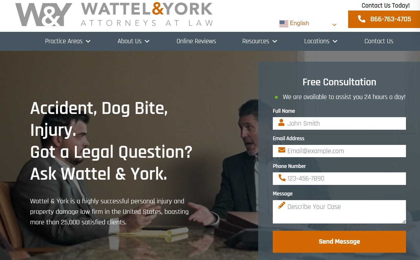
The best thing about Wattel & York’s website is that they talk to their potential clients in their language, and the copy is free from legal jargon. Along with connecting them with prospects, creating such content on personal injury websites give you an SEO advantage as they cover the keywords your target audience might be searching for.
Apart from that, their website has many great things. Still, one thing that separates them from other personal injury lawyer websites is the difference between the compensation they helped their clients get in contrast to what was offered.

Insurance companies usually try to trick claimants into taking the first offer they make. When someone lands on personal injury lawyer websites, they may have already talked to an insurance broker and know how it goes. The price difference will encourage them to consider this law firm as they might not be able to negotiate as a lawyer can.
Furthermore, the animation on the chat box makes you feel like you’ll get a response from a person, not a bot. It can help get more queries than a general live chat box system.
Key Takeaway: Figure out the unique way how you have helped your clients over the years and consider showing that on your website to encourage people to take action.
The Pendergrass Law Firm

The Pendergrass Law Firm website has a clean design, provides a good readability experience with the right size of font and color schema, the page loading speed is good, and offers easy navigation.
Besides getting basic but necessary, things right, they have added a video on their homepage about why this firm does what it does and what it’s like to work with them from a client’s perspective.
Additionally, they have provided their social account links on the sticky header and shown nice pictures of their attorneys wherever they speak about the firm.
They focus on building a connection with the prospects. So they take the first step and schedule a call with them. In his book, Book Yourself Solid, Michael Port discusses that your goal is not to seal the deal on your first interaction. It’s to get them to the next step and the next until they finally buy from you. So, it’s a good marketing strategy for personal injury law firms to consider.
Key Takeaway: Optimize your website to build a good connection with your target audience. And if you’re active on social media, encourage your prospects to connect with you there.
Zaner Harden Law

The color combination of Zaner Harden Law’s site’s Hero puts the attorneys in the spotlight. Besides showing who they are, what they do, and who they help, they engage the prospects with their USP, “Your story will be told.”
If you scroll down, they discuss why you should choose their law firm instead of other personal injury attorney websites. It begins with the words, “Our focus is simple, helping our clients with their cases and get their life back on track.”
When someone or their loved one suffers from an injury, the first thing they wish for is everything to go back to normal. Hence, by tapping on the right emotions of their target audience, attorneys need to make them believe that they “get” them.
Besides that, for credibility, they show the amazing personal injury law settlement results they got for their clients and use video testimonials to show how their clients feel about their personal injury law firm.
Key Takeaway: Connect with your target audience emotionally to engage them with your brand and influence their decision-making process so they decide to interact with you.
Marrone Law Firm
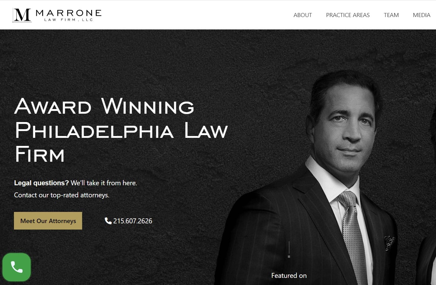
The website design of Marrone Law Firm is neat and simple. However, the color schema could’ve been better, as the CTA doesn’t stand out in the background, despite being dark. To hook prospective clients, they show the amazing settlement results they have gotten for different personal injury claims, conveying that they can do the same for you.
Moreover, the videos and photos on the website show their personal injury lawyers in action, multiple testimonials are available on the homepage, and CTA is mentioned several times, making it easier for potential clients to take action.
Key Takeaway: Best personal injury websites use credibility. So, display the results you get for your previous clients and their testimonials on the home page instead of burying them on a separate page to generate leads from your personal injury website.
The Florida Law Group

The Florida Law Group firm hooks its website visitors with vibrant colors and 38+ years of experience. Plus, they narrow down their personal injury practice areas and have a dedicated page for each type of case they deal with. Such a law firm website design helps the prospects get as much information about your firm as they can.
The web design looks good and clean, although some sections seem a bit off the theme. But their main focus is on the essential details like practice areas, testimonials, and addresses of each office to help the prospects take action.
Key Takeaway: Have a clean personal injury website design that makes the necessary information easily accessible to your target audience.
Staver Accident Injury Lawyers

Chicago Lawyer offers a simple website loaded with the right details their target audience will need to take action. Plus, the functionality of this site provides an even better user experience; you can get your hands on almost every piece of information with a single click without even needing to scroll down.
Besides that, they make it their job to leave no questions unanswered. For instance, they have defined their process right in the front so that the only thing left to discuss is the client’s case, and the prospect would already know how the firm will move forward.
Apart from the process, they have one of the best personal injury websites, providing educational content regarding their practice area. It’s good for both the user’s and SEO’s point of view. Being a personal injury lawyer, publishing such content can help you appear knowledgeable about your industry.
Key Takeaway: Have a high-performance website with great functionalities to provide a smooth user experience. Additionally, answer all your prospects’ questions to get them one step closer to booking a call with your law firm.
The McClellan Law Firm

The McClellan Law Firm’s website has a sharp-looking design that’s created keeping the brand in mind. The overlapping blocks make it look more exciting and spacious and provide all the required information.
Personal injury attorneys can opt for this design as it helps you provide more details without overwhelming the readers. Plus, the content block presses you to keep the copy concise.
The pictures are good-looking, and the overall design is quite classy. This type of website remains in your head even after leaving the site. They’re good for building brand awareness.
Key Takeaway: Build your website keeping your brand in mind and align your personal injury website design and copy with that.
Laureti & Associates

Laureti & Associates law firm’s website begins with an entertaining Hero that helps them hook the web visitors.
Plus, the website structure is seamless and leads people from one section to another smoothly, increasing the time they spend on the website and, eventually, improving their chances of taking action.
Besides that, their unique selling point: “When we take your case, we take your cause,” helps them stand out from the competition. The personal injury law website has a separate resource page that answers all the legal questions of their clients. It’s good for personal injury law firm SEO and user intent.
Key Takeaway: Provide a smooth website navigation experience for your prospects.
Neri Law Group

A classic website design linked with great functionality is a perfect combination of a high-performance website. Neri Law Group has leveraged it for their personal injury lawyer website.
They have a neat design with the right font size, color schema, and letter spacing, providing a good readability experience. Plus, they offer a 24×7 online chat service, improving customer experience.
Besides that, their phone number and the call to action are present multiple times on web pages. It helps the website visitor take action whenever they’re finally ready.
Key Takeaway: Display your call to action multiple times on your web pages and make the contact information obvious. Moreover, provide after-hour call services never to miss an opportunity to move your leads forward in their buyer’s journey.
Buchalter, Hoffman & Dorchak

The website design of Buchalter, Hoffman, & Dorchak law firm is quite basic. However, despite having a few functions, they do a good job of providing the necessary information. Plus, it leverages white space, provides an easy navigation experience, is user-friendly, and speaks directly to the target audience.
Although, including the pictures and bio of attorneys, even with a basic website design, would’ve helped.
Key Takeaway: If you want to build a website on a tight budget, consider including the required information, professional headshots of your attorneys, and specific add-ons like a chat option, if not a payment method, on your site.
West Coast Trial Lawyers
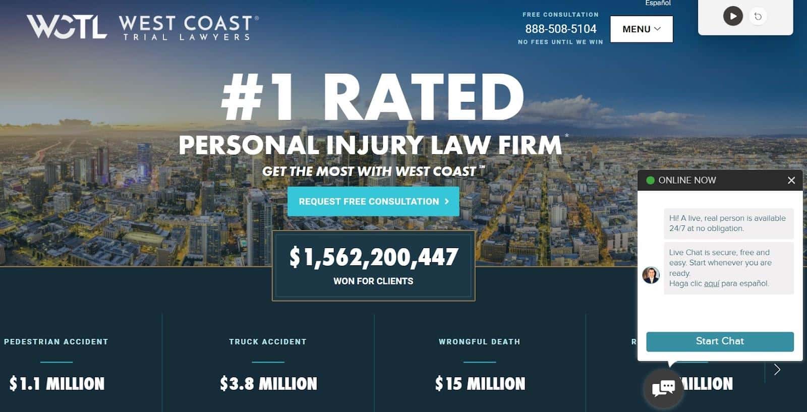
West Coast Trial Lawyers have a value-pointed design. Plus, it’s available in two different languages, which helps cover a large range of audiences. Additionally, it gives you an advantage over competitors, reduces your bounce rate, and increases the conversion rate.
For credibility, they have displayed the compensation amount they’ve gotten for different types of cases in personal injury, hundreds of reviews on several platforms like Yelp, Facebook, and Google, recognition in press and TV, and shown why they’re a better option than their competitors.

Key Takeaway: If your audience speaks different languages, consider having a multi-lingual website and give your prospects solid reasons to choose you over your competitors.
Banafshe Law Firm

The main focus of this website is to build credibility and encourage users to take action. They display previous clients’ case results, answer legal questions, and show video testimonials.
If someone is interested in their services, they may consider listening to what their former clients have to say.
The hero video hooks the readers. However, the color schema and font size could’ve been better as they affected the website’s readability.
Key Takeaway: Show credibility by displaying video testimonials on your website.
Personal Injury Attorney Websites Best Practices
Here are some essential things you should remember while designing your law firm’s website.
- Optimize your personal injury website for SEO,
- Make sure your pages load fast (and pass the Core Web Vital scores),
- Create a mobile-friendly website,
- Provide an easy navigation experience for your users,
- Consider website accessibility to ensure people with disabilities can use your site,
- Invest in good copywriting (hire our legal content writing services if you need help!),
- Make your contact information readily available,
- Include strong CTAs multiple times on your web pages,
- Display your attorney profiles,
- Answer legal questions and FAQs,
- Add a disclaimer.
Final Thoughts
Websites are an important component of the overall branding for personal injury law firms. They are your home for legal marketing efforts and help you make a strong case for your services. I hope the attorney website examples in this article got your creative juices flowing.
You can incorporate these tips into your PI website, or just contact us — we’ll offer a free quote for designing your personal injury website!
Table of Contents
Related Articles
Dominate Your Market with Digital Marketing Services That Deliver
Talk to a certified professional today, and we will design a strategy specific to your case.


