7 Best Bankruptcy Lawyer Web Designs in 2025
If you don’t have a site for your bankruptcy law firm, you’re missing out on a lot. It lets you leverage online marketing and generate consistent website visitors to convert into leads and clients.
At the same time, just because you have a site doesn’t mean all your bankruptcy leads will find it and contact you. You must ensure it contains all the right elements and observes the best design practices. Doing these encourages visitors to stay on your website and take the next step.
So, if you have an underperforming site or plan to build one, this post is for you. I’ve listed bankruptcy law firms with the best-looking websites you can use for inspiration. I’ve also enumerated time-tested design strategies you must implement on your site to maximize its lead generation abilities.
Bankruptcy Lawyer Web Designs
7 Best Bankruptcy Law Firm Websites
Many attorney websites are vying for your audience’s attention in the bankruptcy space. But the seven sites below are the ones you should watch out for. I talk about the factors that makes each site great so you can implement them on your site. Let’s begin!
Marks Gray
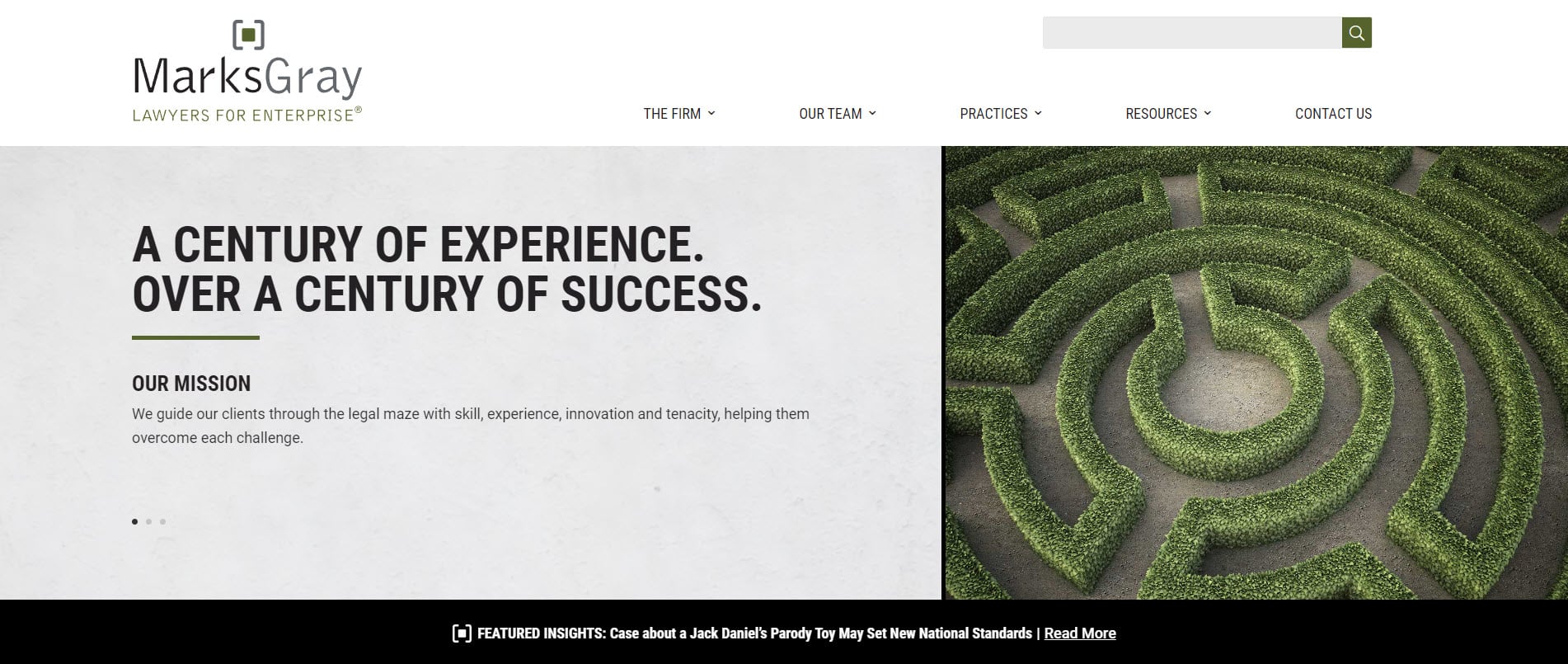
Marks Gray boasts an intriguing color scheme that exudes authority and control. It is complemented by the site’s user-friendly flow, allowing visitors to explore its content with ease. In particular, its menu bar contains the firm’s different practice areas and individual pages for its attorneys and paralegals. These pages feature their certifications and contact information.
The Fealy Law Firm, PC

This website boasts an intriguing yet captivating color scheme with smooth-lined decorations. These design elements help give The Fealy Law Firm PC a playful and creative feel without losing its authoritativeness.
Two buttons on both sides of the screen open the live chat widget. They ensure potential clients don’t miss out on the opportunity of chatting with the firm for legal help. The site also presents the law firm’s countless accreditations and awards from prestigious legal organizations in a carousel format. They give prospective clients more reason to trust its bankruptcy services.
Simon, Peragine, Smith & Redfearn, LLP
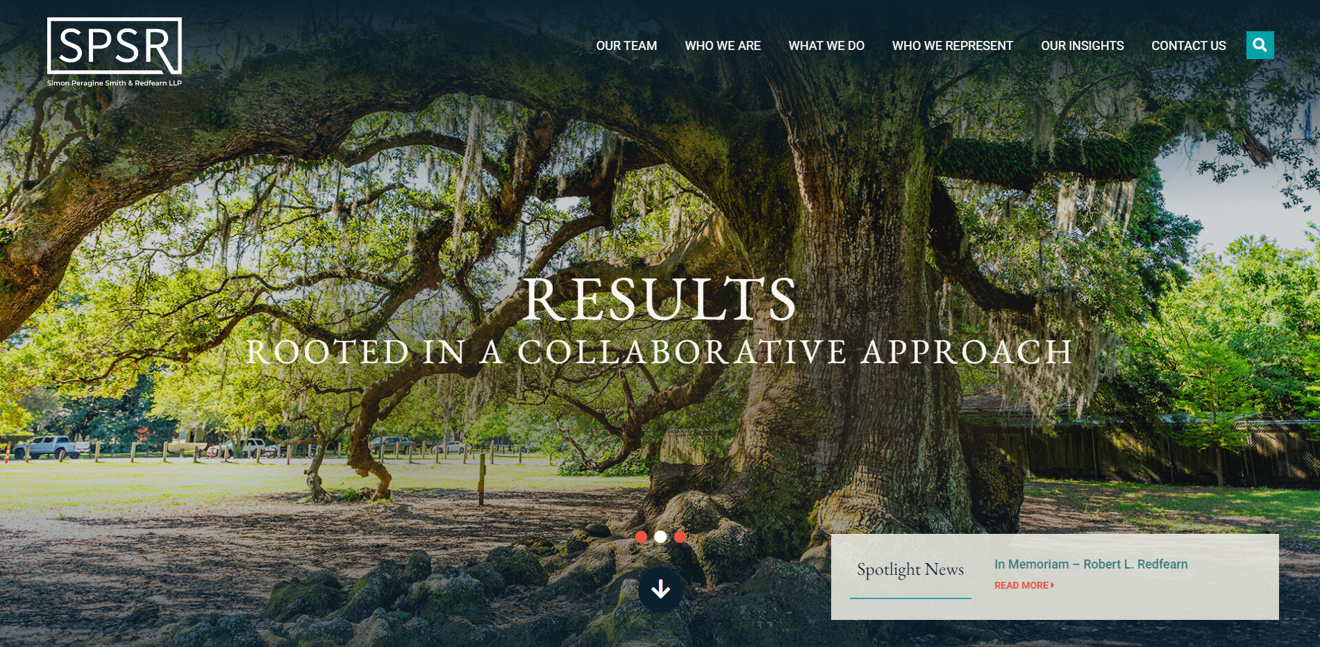
Simon, Peragine, Smith & Redfearn, LLP’s use of teal and cream design colors is easy on the eyes and gives visitors a reassuring feeling. It also does a good job introducing the firm and its attorneys to visitors.
The site shows its awards and recognitions from popular review sites and discusses the firm’s commitment to excellence for its clients. It also shares how its lawyers give back to the community outside of their professional practice. Putting a spotlight on its lawyers allows visitors to connect with the law firm more, allowing them to attract more bankruptcy cases.
Bouhan Falligant LLP

Bouhan Falligant LLP combines modern and sleek design while embracing its rich practice history. This bankruptcy lawyer’s website uses high-quality images of digitally restored photos from the 90s and earlier.
It also showcases the milestones it achieved using a dynamic timeline widget that makes navigating through its history easy. By putting its history at the website’s forefront this way, the bankruptcy firm establishes itself as enduring and trustworthy, helping it attract new clients.
Borowitz & Clark LLP
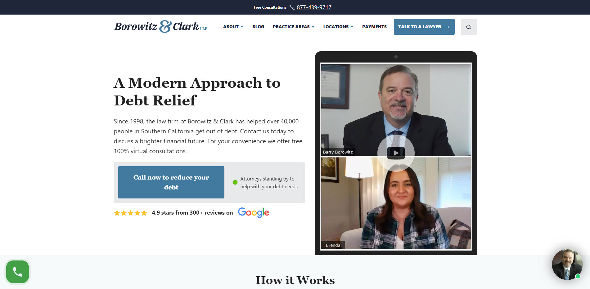
Borowitz & Clark LLP optimizes its above-the-fold with tons of clear calls to action (call via phone, link to contact form page, and chat widget). These follow website visitors as they scroll down the page as well. The site also walks them through how its free consultation works.
If that doesn’t convince them to make the call, it features reputable publications and shows the firm’s partners appeared. There are also badges of recognition given to the firm from legal organizations at the bottom of the homepage, further building trust with its target audience.
Weintraub Zolkin Talerico & Selth LLP
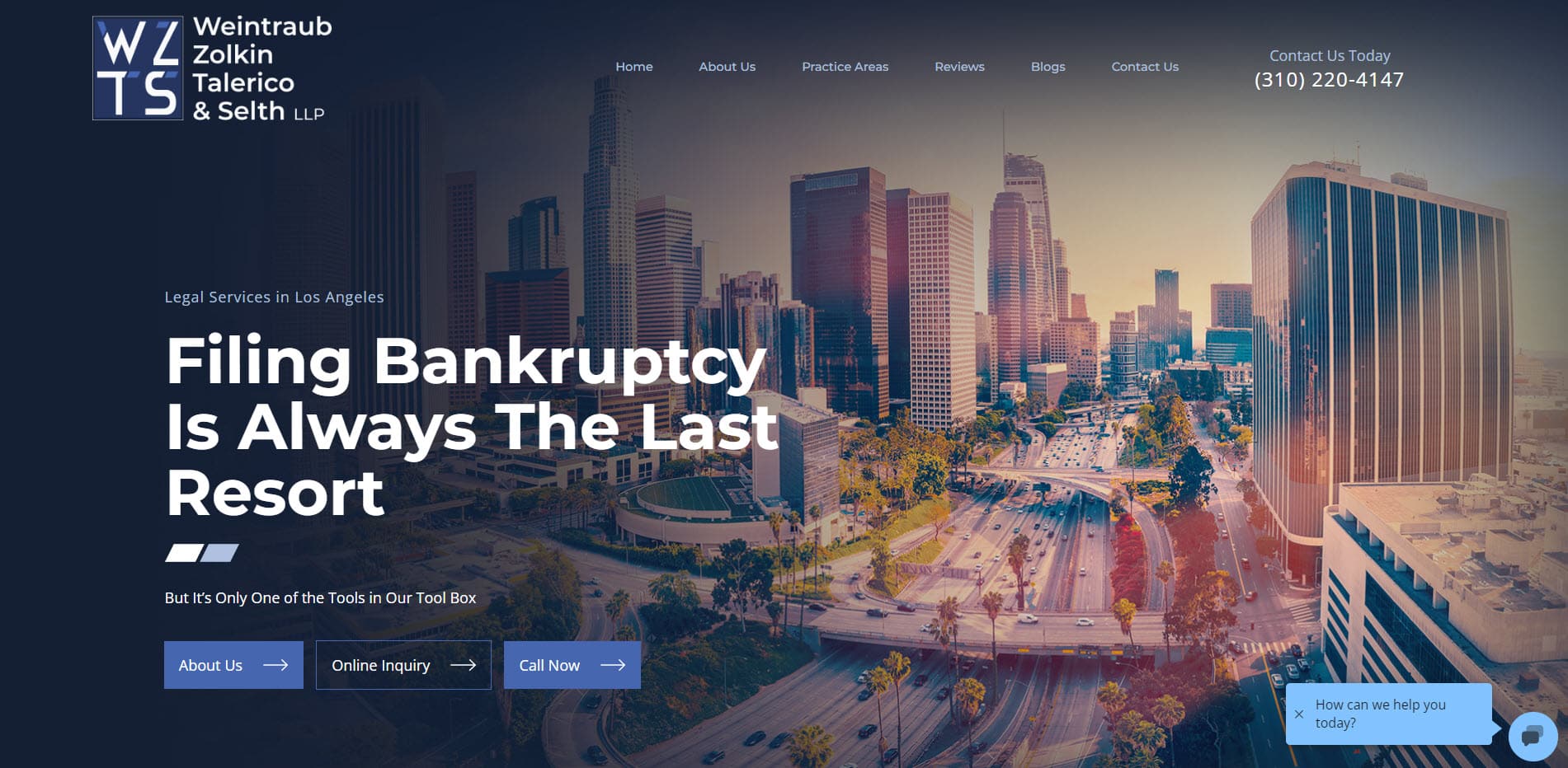
Weintraub Zolkin Talerico & Selth LLP embraces a simple yet consistent and focused style throughout its pages, lending an air of professionalism and cohesion. For instance, its images use a specific filter to maintain its design identity.
The above-the-fold section links to all its important pages, but the “Online Inquiry” call-to-action (CTA) button stands due to having a color than the rest. Also, a fixed chat widget appears on the screen’s bottom-right side. This makes reaching out to the law firm easier regardless of which part of the page visitors are.
Miller Thomson LLP

Miller Thomson LLP uses an unconventional site layout to its advantage. Its simple white and orange color scheme serves as the backdrop for presenting its news articles and links to other pages on the site.
The client work section contains short press releases about companies and enterprises the law firm worked with, which is a great way to show its trustworthiness. But much of the site navigation relies on the menu bar, featuring everything you need to know about the firm.
What Makes a Compelling Bankruptcy Attorney Website Design?
From the legal websites above, it’s clear that your law firm site’s web design is an integral part of your digital marketing strategy. Creating a website that seamlessly explains the bankruptcy process allows you to make a good first impression on visitors. That said, below are ways on how you can do this to get your law firm marketing efforts up and running.
Distinctive and Memorable Branding
Establishing a recognizable law firm brand improves your online presence and enables people to remember your practice much easier, which could result in higher conversions. To do this, develop a visual identity that you want to identify with your law office.
Choose the color palette, fonts, and images that best reflect what your law firm is about. You also need to design a logo that visually matches your firm’s values. Finally, consider crafting a cohesive narrative that ties all the brand elements you’ve chosen and points back to your practice.
From here, use the brand guidelines across all channels to reinforce the association of these elements with your bankruptcy practice. That means using the same logo, colors, and typography you used on other marketing materials on your website. Doing so enables you to showcase your branding to your audience consistently.
Prominently Displaying Your Social Proof
Social proof is one of the best bankruptcy attorney marketing tactics for your lead generation efforts. Displaying awards from reputable legal organizations and positive customer testimonials convince your target audience that they need your legal counsel, effectively acquiring new business for you.
If you don’t have social proof yet, email past customers asking for reviews of your services. They should detail how you addressed their unique needs and helped win their cases. Have them write their reviews on Google, Avvo, Lawyers.com, and others. Then gather the best reviews from all these sites and feature them on your bankruptcy law website.

Seamless UX Across Devices
Part of a well-designed website is one that has great functionality. Visitors should be able to browse the site and find what they’re looking for without problems. The website should also load fast enough to get visitors to engage with its content soon.
Designing a site that provides visitors with an easy user experience (UX) allows you to reap the benefits of search engine optimization (SEO). Following a checklist that observes the best web design practices coincides with optimizing your website for search engines. When done correctly, you can increase your law firm’s search engine rankings for your target keywords.
To ensure you observed the best practices of designing a site and nothing slipped through the cracks, run your site on GTMetrix. From the results, you can see your site’s overall performance and suggestions for improving it.

Easily Available Contact and Business Information
Aside from showcasing information about your bankruptcy law practice, you want people to contact you for their questions. Common contact details to include on the site are your phone number, email address, and physical address.
However, consider that some people prefer contacting you in specific ways. They can increase your chances of getting more leads that you can turn into cases. Start by featuring a contact form on your homepage or creating a dedicated page. This way, they can email you, and you can reply on time.
A live chat widget on your site is also a powerful tool to get people to contact you. However, be sure to respond quickly to incoming messages so as not to lose them as leads. Assign a dedicated chat support person to take care of this. Finally, you can link your social media profiles if visitors prefer reaching out and connecting with you there.
Clear and Compelling Value Proposition Across The Website
Presenting your firm’s unique selling points (USPs) through your web design separates your law firm from your competitors and attract the type of people you want to become your bankruptcy clients. Start by highlighting the unique benefits of your services and how they differ from competitors. You can even tie this in with your content marketing efforts.
Create a section that discusses your USPs on your homepage and links to comparison posts you’ve written about your competitors. Just make sure that the comparisons are objective and put your law firm in a positive light. Then link to these posts on relevant pages using CTA widgets to drive attention to these posts so more people learn about your value proposition.
Hire On The Map Marketing for Your Bankruptcy Lawyer Website Design Needs
Whether you want a new website or redesign your old one, On The Map Marketing can help. Our legal marketing services include providing your law firm with a web design that will compel visitors to become clients.
Our design team follows the best and latest web design trends to help your law firm stand out from the pack. The team also charges our law firm websites at competitive prices that you can recoup over time with the many clients you’ll attract. Learn how our agency we can help you with your website design by contacting us.
Table of Contents
Related Articles
Dominate Your Market with Digital Marketing Services That Deliver
Talk to a certified professional today, and we will design a strategy specific to your case.


