55 Best Law Firm Websites in 2025
Home » Law Firm Digital Marketing » 15 Best Attorney Websites in 2025
Most attorneys have outdated websites. Some have decent websites but fail to deliver their legal marketing strategy results.
Besides, even though your website is the first impression on your prospects, merely having a beautiful design is insufficient — a good law firm website should generate leads for your law firm, get you new clients, be optimized for SEO, and build trust with your potential clients.
While choosing the attorney websites for this article, we relied upon some of the most important SEO factors such as a client-centric website design, user experience, CTA, site structure, smooth navigation, site functionalities, and core web vitals.
Table of Contents
Let’s go through them one by one.
Related: Best Law Firm Web Design Agencies
55 Best Lawyer Website Examples
1. Jesse Minc Personal Injury Law
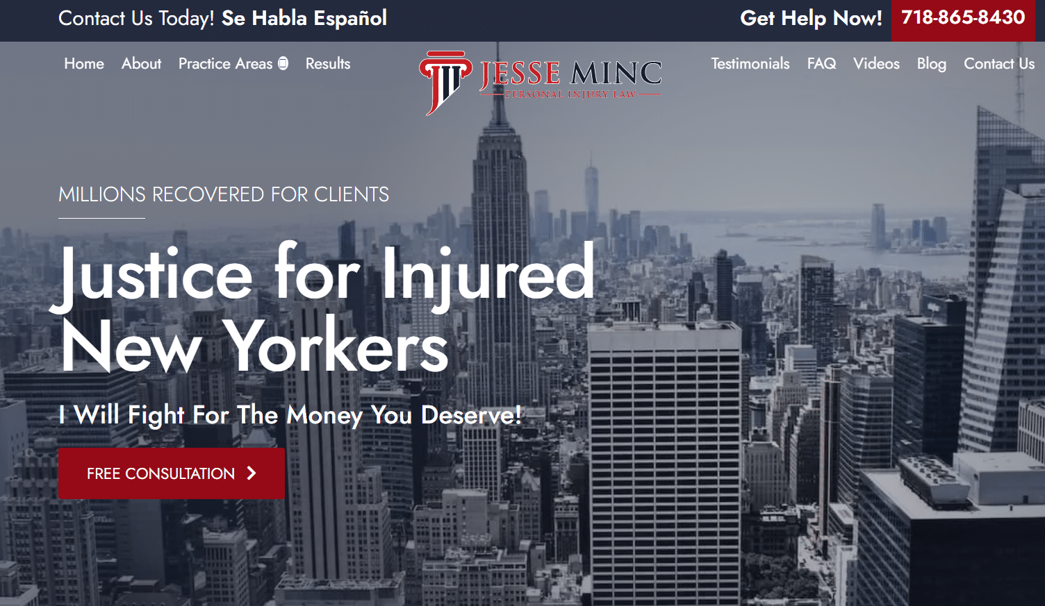
Jesse Minc Personal Injury Law has a polished and professional design, reflecting the expertise of the solo practitioner. The website features clear calls-to-action (CTAs) that guide visitors to take the desired action. Plus, the CTAs and social media icons are well-positioned and prominent, making them easy to find and use.
2. Orlando Criminal Defense Attorney
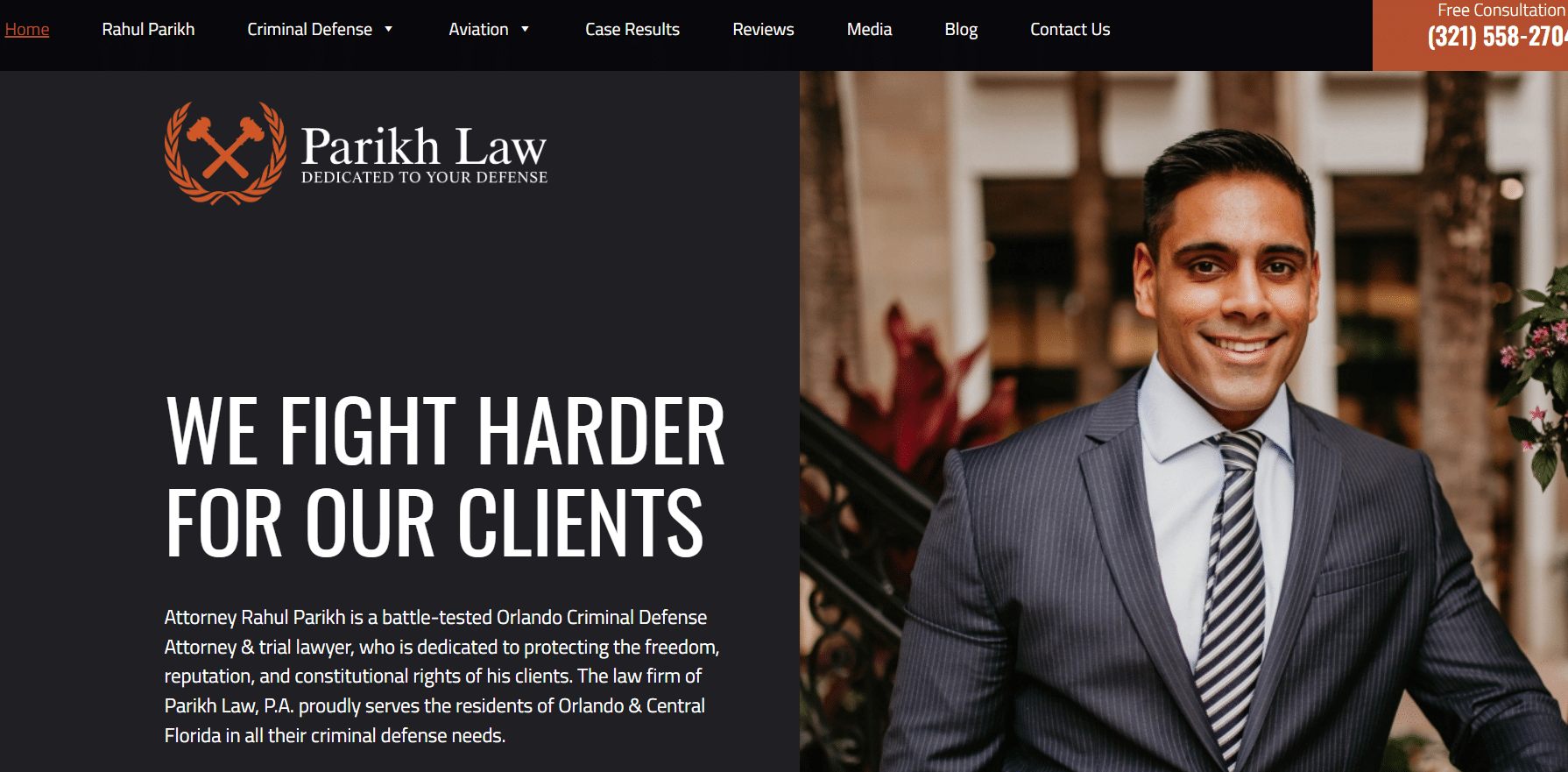
The site features an impressive modern and sleek design built on a minimalist layout with a focus on showcasing the attorney’s expertise and experience. The use of whitespace, typography, and color scheme is well-balanced and enhances the user’s experience.
3. Hansford Law Firm
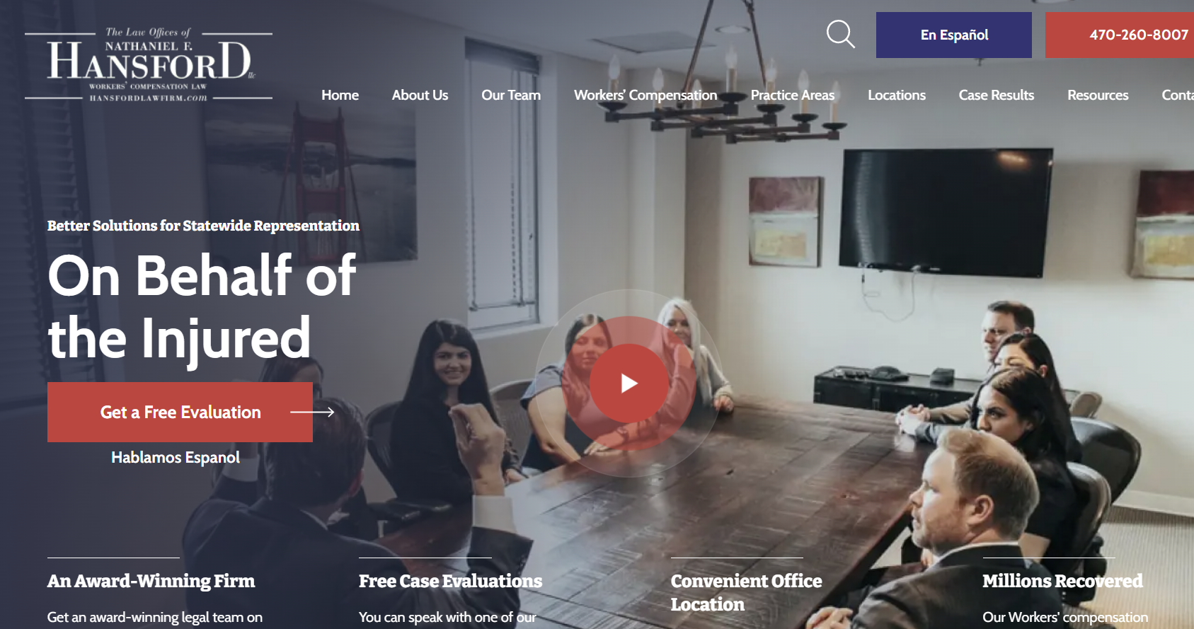
Hansford Law Firm’s website boasts an engaging hero video that immediately captures the user’s attention, while the smooth navigation makes it easy to navigate and find the required information.
4. 1800 Injured
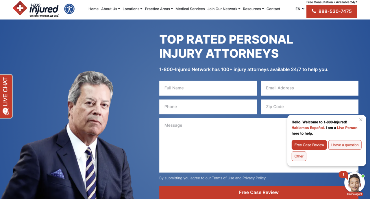
1800 Injured places a strong focus on clarity and improved user experience on their website. It makes it easy for visitors to quickly find the information they need. The website also features high-quality images of the attorneys at work, which add a personal touch.
5. The Pendergrass Law Firm

This attorney website has a simple and straightforward design that prioritizes ease of use and clarity. The use of good color contrast empowers the content, ensuring that it stands out and is easy to read.
6. Lopez & DeFilippo , P.A.
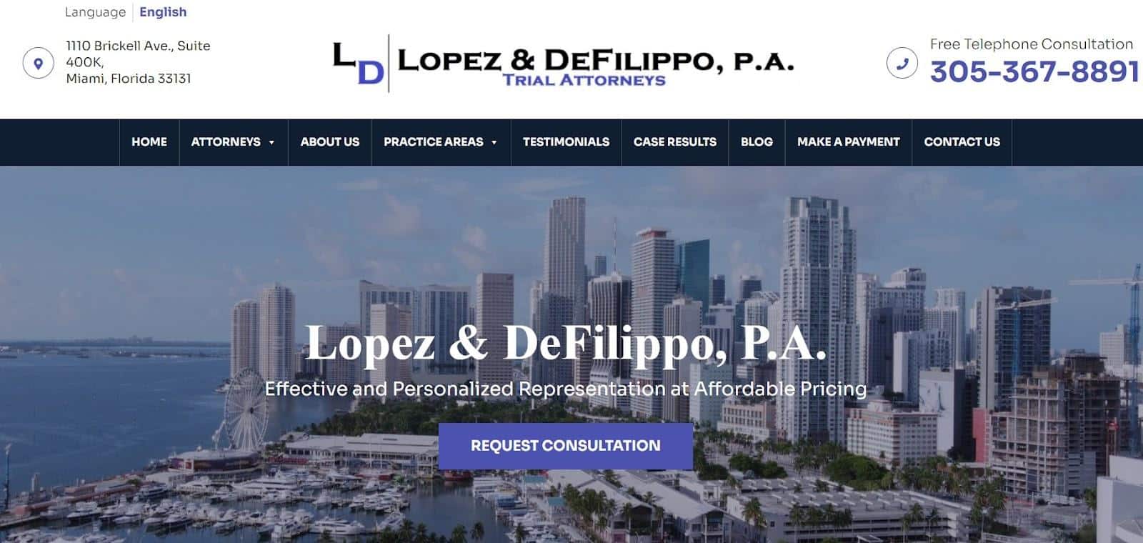
Lopez & DeFilippo, P.A. has a modern, minimalist website design that gives it a clean and streamlined look. The playful and welcoming design, particularly in the practice area section, sets it apart from other legal websites and creates a friendly and approachable atmosphere. This design choice helps users feel more comfortable exploring the legal services that the firm offers.
7. Staver Accident Injury Lawyers
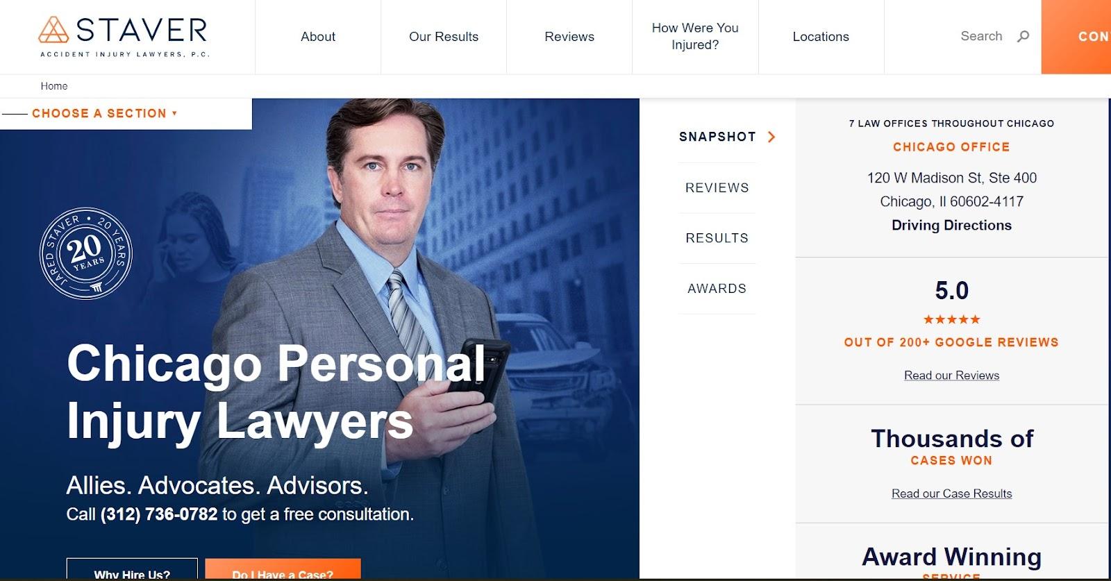
This is a personal injury law firm with a modern and sophisticated website design with a sleek layout and high-quality images that catch the eye. The use of negative space and typography creates a highly readable and user-friendly look, enhancing the overall experience of this personal injury lawyer website.
8. The McClellan Law Firm

This is one of the best law firm websites with a thoughtful design and a high-class color scheme. The layout is carefully crafted to make it easier for visitors to find the information. The high-quality photos throughout the site add a touch of elegance, and the color scheme is professional and welcoming.
9. Horne Coupar

Horne Coupar’s website has a modern, minimalist design that exemplifies a corporate-style online presence. The simple and streamlined layout is structured to prevent visitors from being overwhelmed with a large amount of text.
10. Schoenberg Family Law Group

Schoenberg Family Law Group’s website has a playful and welcoming design that puts visitors at ease. The bright and cheerful color scheme adds to the friendly and approachable atmosphere, making it an excellent choice of inspiration for small businesses looking to create a warm and welcoming online presence.
11. PAGE LAW

Page Law’s location-based domain helps with local SEO and their minimal design, language free of legal jargon, and event-based articles help them build backlinks and increase their domain rating. Adding internal links on your own website can also help with it.
12. Tamara Holder
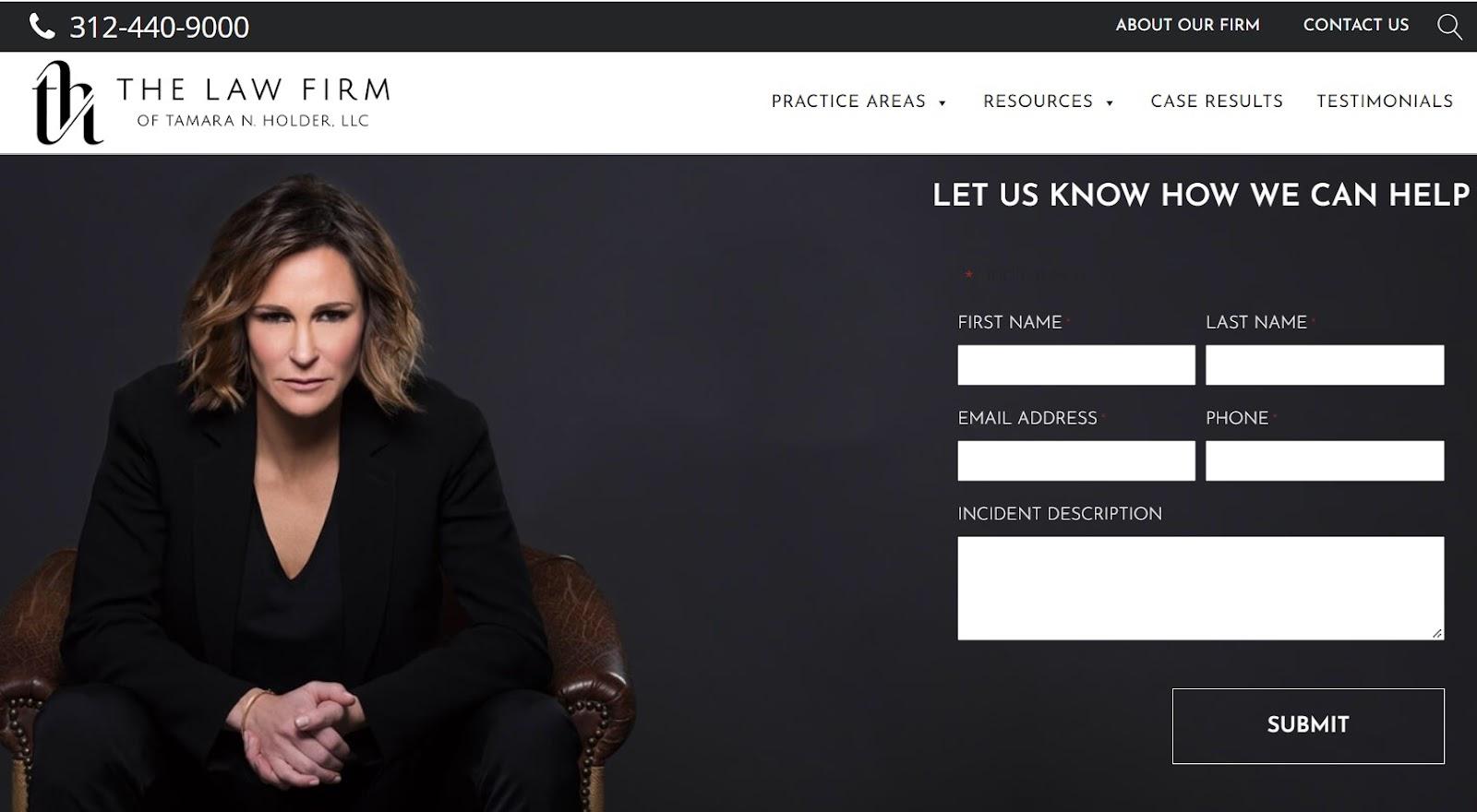
Tamara Holder’s website has a focused design for the practice area they serve. Although, it’d be a great option to add a Recognized By section to improve their credibility.
13. Barr & Young Attorneys

Barr & Young Attorneys’ website has a sharp and detailed design that captures the essence of the law firm industry through its great font choices. While the navigation could be structured better, the website effectively showcases the firm’s expertise and presents it as a reliable source for legal assistance.
14. Modern Law
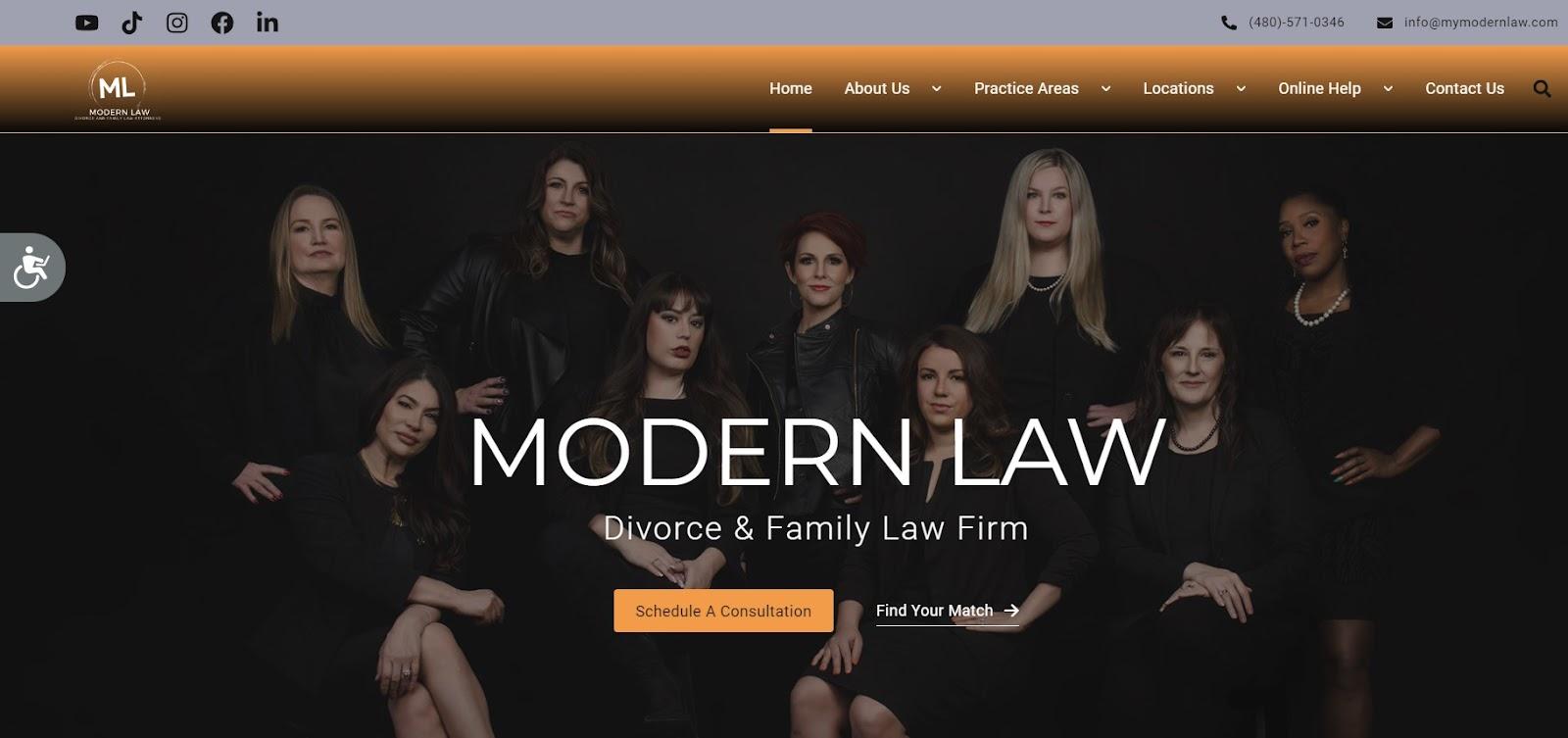
Modern Law is a Divorce and Family law firm. Their website is super easy to navigate, has an accessibility option, and all the necessary information is just a click away. It improves the user experience, which Google considers while ranking your website.
15. Thomas & Associates

16. Oykhman Criminal Defence Law

Oykhman Criminal Defence Law’s website boasts an engaging hero section that captures visitors’ attention right away. The prominent display of their Google rating and testimonials adds credibility and trustworthiness to the firm. The website is well-designed, with pixel-perfect spacing that ensures a clean and organized look.
17. Trey Porter Law
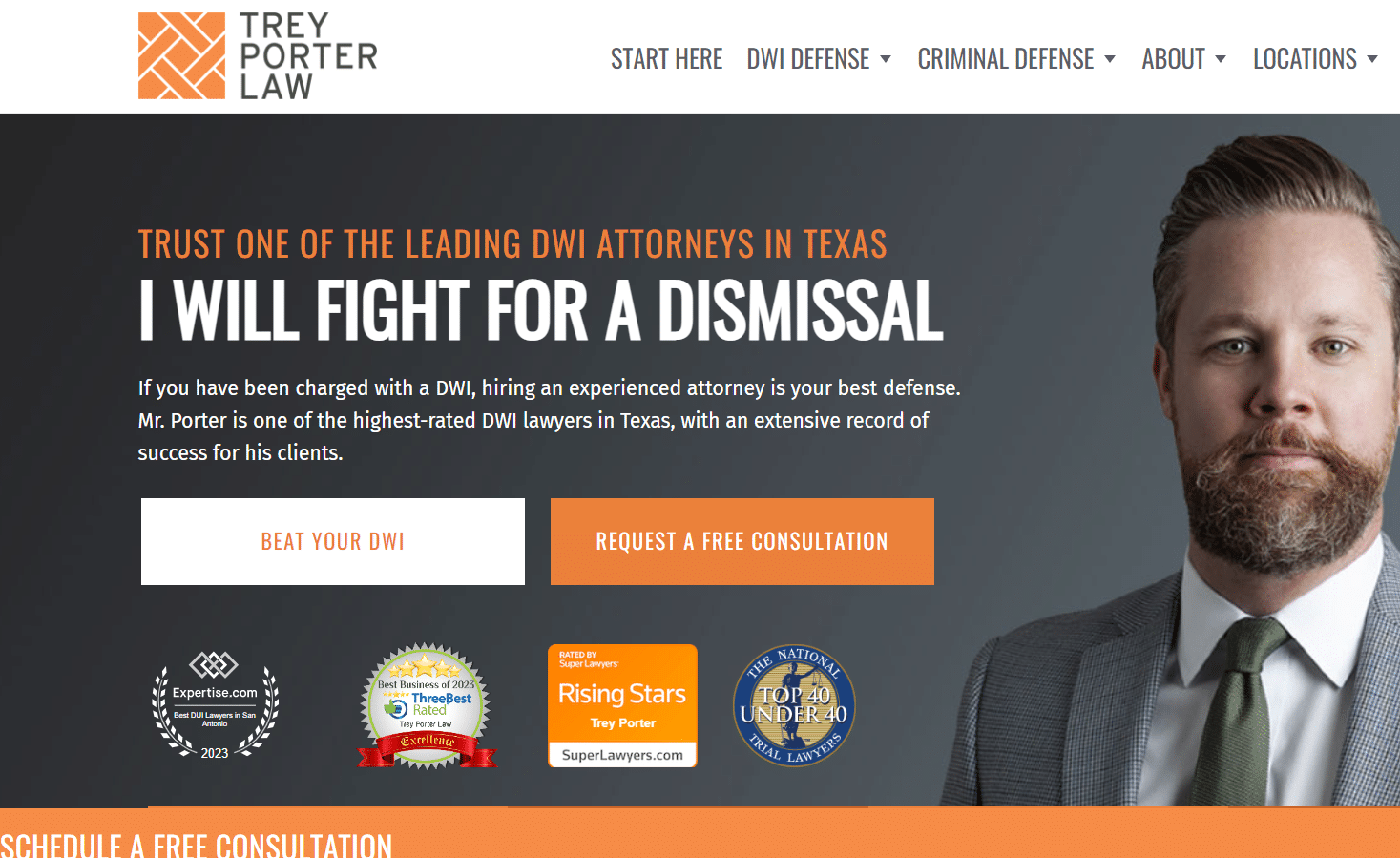
Trey Porter Law’s website is video-rich, providing visitors with an engaging and informative experience. The website design is clean and modern, and the call-to-action (CTA) buttons are placed in interesting locations that grab visitors’ attention.
18. The Law Office of Bryan R. Kazarian
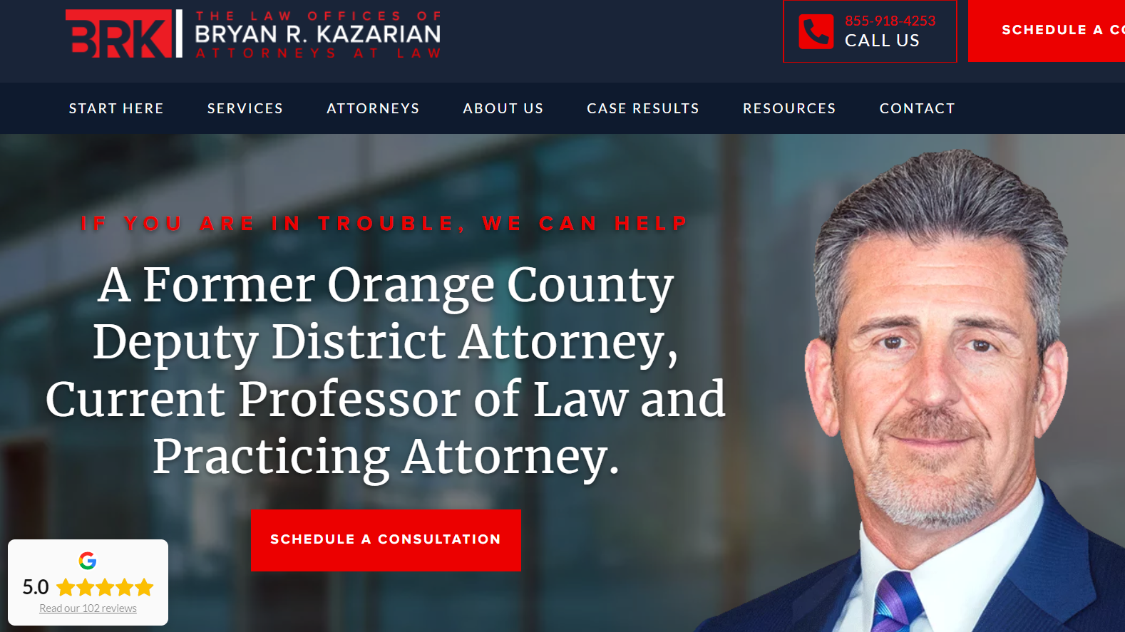
This website offers a great attention to detail, a clean and organized layout, and a professional color scheme that makes this website stand out. The clear and concise value points and easy-to-navigate FAQ section make it easy to find the information. Plus, the interlinking of content is also well thought out.
19. Taylor Janis Workplace Law

Taylor Janis Workplace Law’s website stands out with its unique background pattern and sharp graphics. The user-friendly navigation is tailored to employee or employer types. The website’s location-based content adds an extra layer of relevance and specificity.
20. McCarthy Tetrault

This law firm’s website features a non-traditional layout style that sets it apart from others. The bright color scheme and creative design elements make it visually appealing and eye-catching.
21. BD&P

BD&P’s website has a slide, presentation-based design that is unique and engaging. Still, while this design may work well for a single-use case, it can become a bit less convenient for extensive use.
22. Hamra Law Group

This website has an attorney-focused design, with a prominent portrait of the lead lawyer. The layout is clean and simple, with an emphasis on showcasing the expertise of the lawyer.
23. Chudnovsky Law

Chudnovsky Law’s website features a sharp and visually appealing hero design that immediately catches the visitor’s attention. However, as the user scrolls down, the website’s content and design seem to lose their initial appeal, with some sections failing to capture the user’s interest.
24. White & Case

White & Case’s website features a corporate style design that looks professional and polished. However, the design lacks personality and fails to convey a unique brand identity that could’ve engage users effectively if the website had them.
25. YLaw GroupBend Law Group

The YLaw Group website features a light and attractive design with custom-crafted photos that enhance the website’s aesthetic appeal. The information flow is excellent, making it easy for visitors to find what they need.
26. Evergreen Elder Law
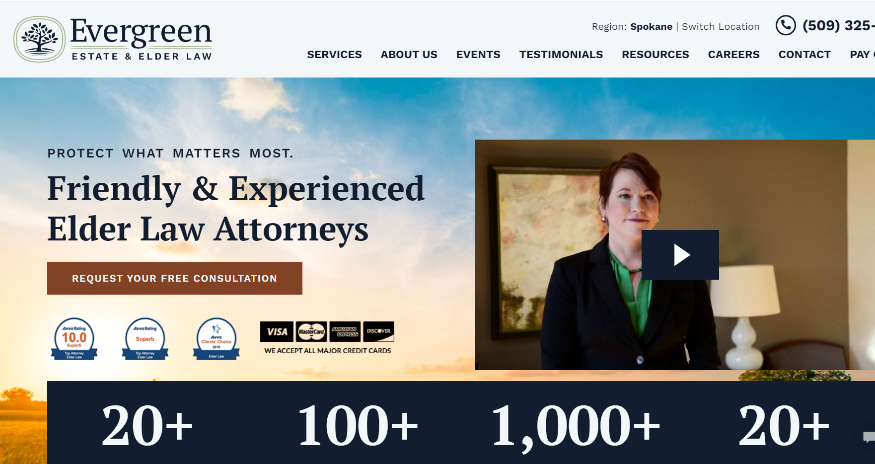
With a personalized, self-centered style, Evergreen Elder Law’s website creates a welcoming and calming atmosphere for potential clients. The color scheme, in particular, is a standout feature, with soft and muted colors that complement the firm’s focus on elder law.
27. Weisfuse & Weisfuse

Weisfuse & Weisfuse’s attorney website boasts a typical design that is familiar to many law firm websites. The high-contrast colors and fonts add a level of seriousness to the website.
28. Bick Law

The website has an interesting initial look, but the section with a ton of badges is a bit overwhelming; might as well remind one of a fridge with too many magnets on it. But the overall website design is creative and eye-catching, which could benefit from better organization and layout to avoid cluttered sections.
29. Brenton Legal

Brenton Legal’s website design is simple and straightforward, with a minimalist approach that prioritizes ease of use and navigation. While the design may lack flashy graphics or complex features, it offers a clean, uncluttered, and professional look that conveys the firm’s no-nonsense approach to its legal services.
30. 9/11 Victim Attorney

The website of 9/11 Victim Attorney features excellent illustrations and an entertaining style. The design is visually appealing and captures the attention of the audience.
31. Bhatt Law Group
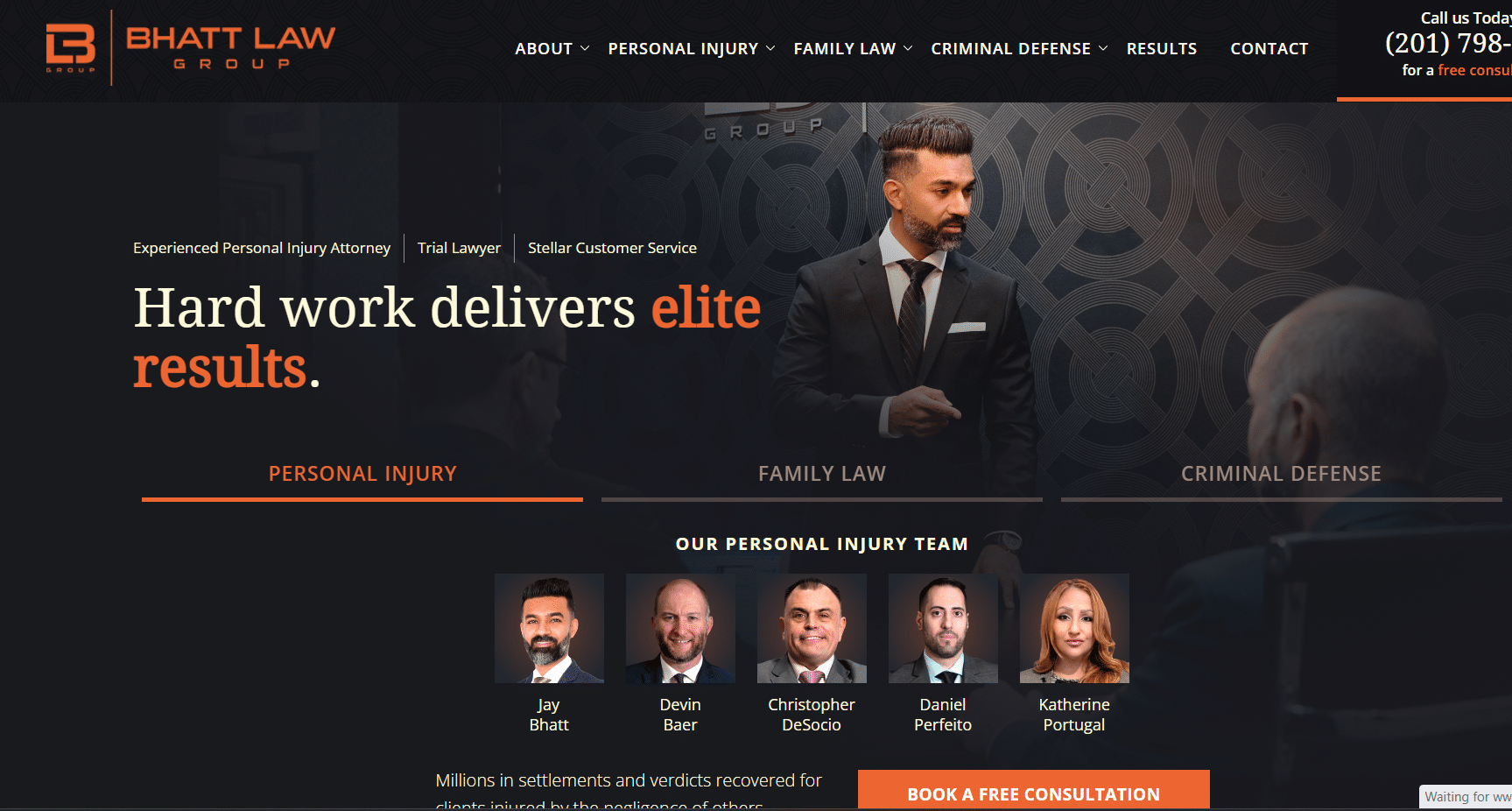
Bhatt Law Group’s website boasts a slick and professional design that exudes a sense of reliability and trustworthiness. The site is peppered with integrated branded decorations that complement the overall style, creating a cohesive and memorable look. Plus, it offers a seamless experience with a consistent design throughout the site.
32. Hogan Lovells
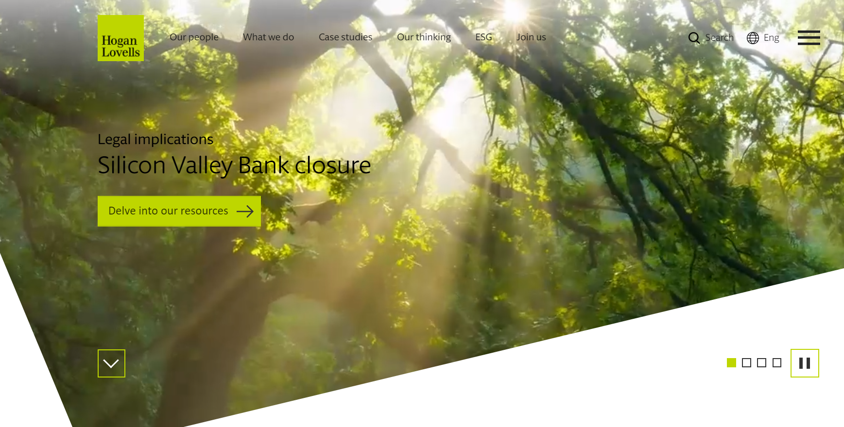
Hogan Lovells has a modern and fresh look that presents a sleek and professional appearance. The design of the website is contemporary, with a minimalistic and clean layout. The color scheme is muted and restrained which allows visitors to focus on the content and navigate the site with ease.
33. Zafiro Law
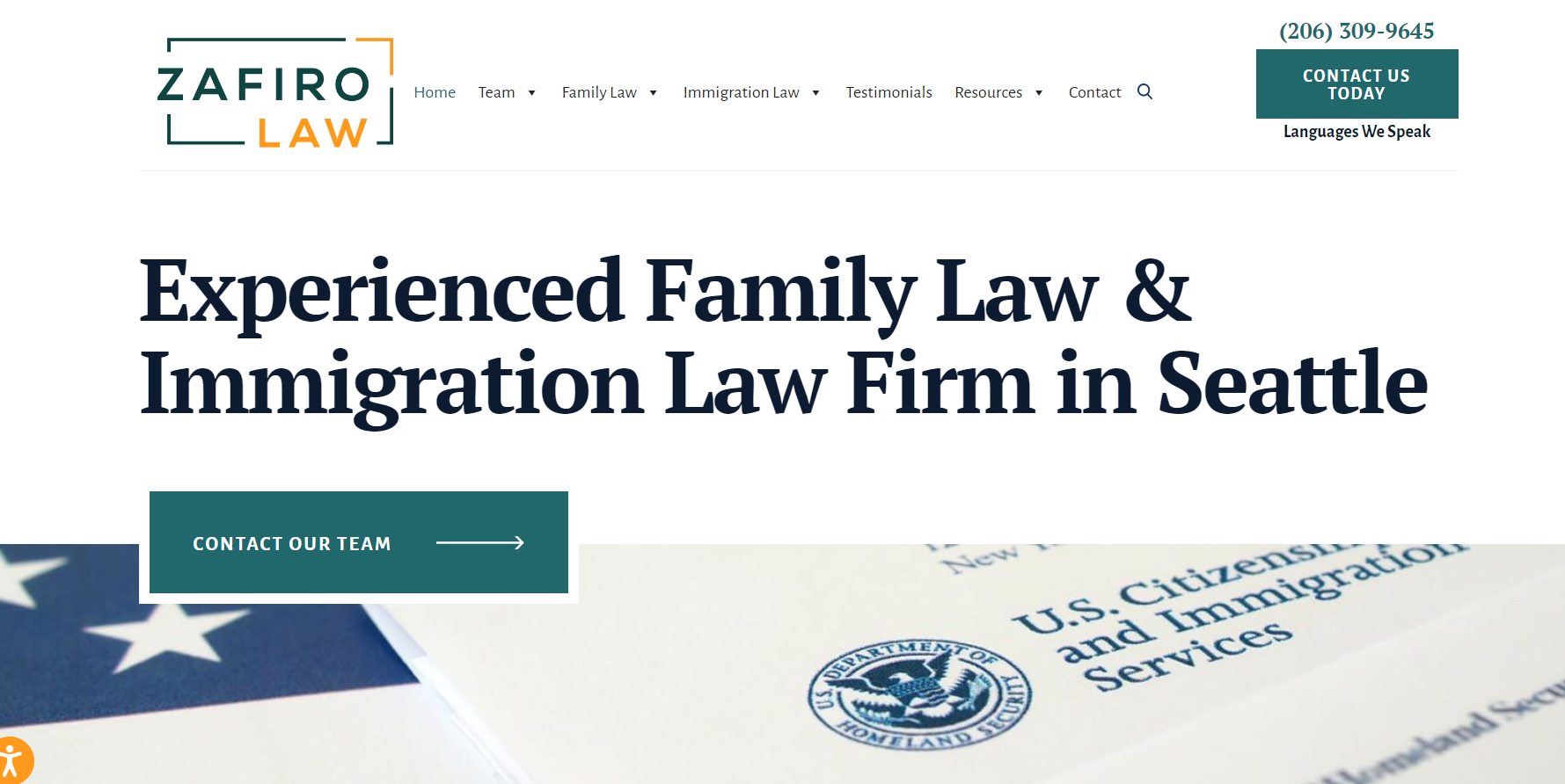
Zafiro Law’s website has a clean and simple design that makes it easy to navigate. The website offers a smooth flow and a minimalist design with a neutral color scheme and simple typography that creates a professional and modern look.
34. Foot Anstey

The website has a modern and professional design with an impressive use of branding. The color scheme and typography are consistent with the brand’s image, giving off the site a cohesive look and a professional impression, reflecting the firm’s quality of service.
35. Acapo

The website design of Acapo features a light theme with a corporate feel, enhanced by a custom video that showcases the firm’s work environment and team.
36. Roberts Law

Roberts Law’s website has a simple design that is enhanced by the use of localized photos, which helps in increasing recognizability and trustworthiness within the local community. The website’s straightforward design offers smooth navigation.
37. C.A. Goldberg
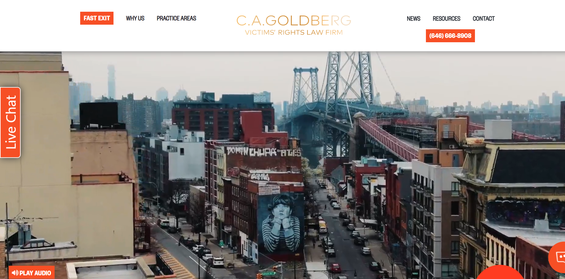
C.A. Goldberg’s website features a colorful design with an entertaining video element that captures the viewer’s attention and adds an extra layer of engagement. The site offers a playful and approachable feel while still maintaining a professional look.
38. Galbally & O’Brian
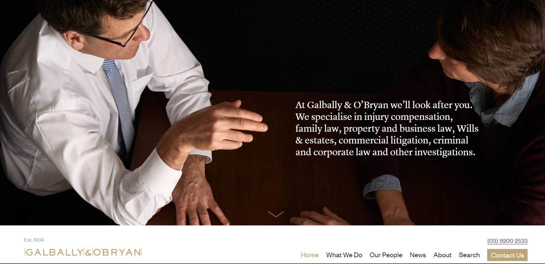
Galbally & O’Brian’s website is a straightforward representation of the law firm’s brand with branded colors that create a good vibe. The website is designed to offer users a simple yet effective user experience, with easy navigation and clear information about the firm’s services.
39. Oshawa Criminal Lawyer
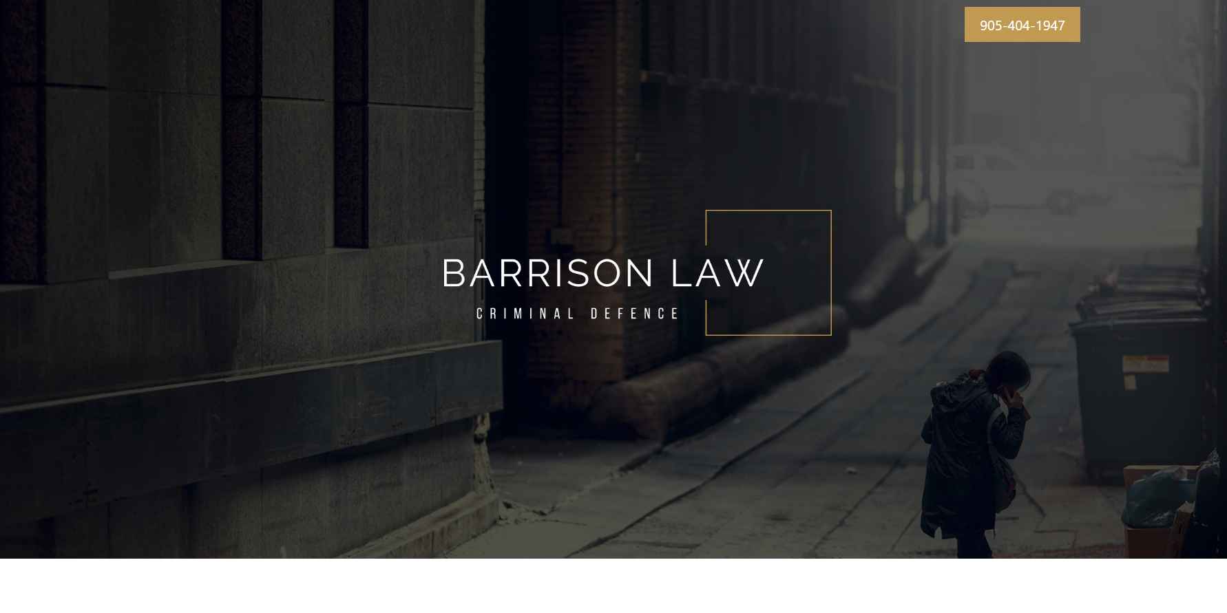
Oshawa Criminal Lawyer’s website features interesting animations, but unfortunately, they become too repetitive. Despite this flaw, the website still manages to impress with its sleek design and intuitive navigation.
40. Kademenos, Wisehart, Hines, Dolyk & Wright Co. LPA
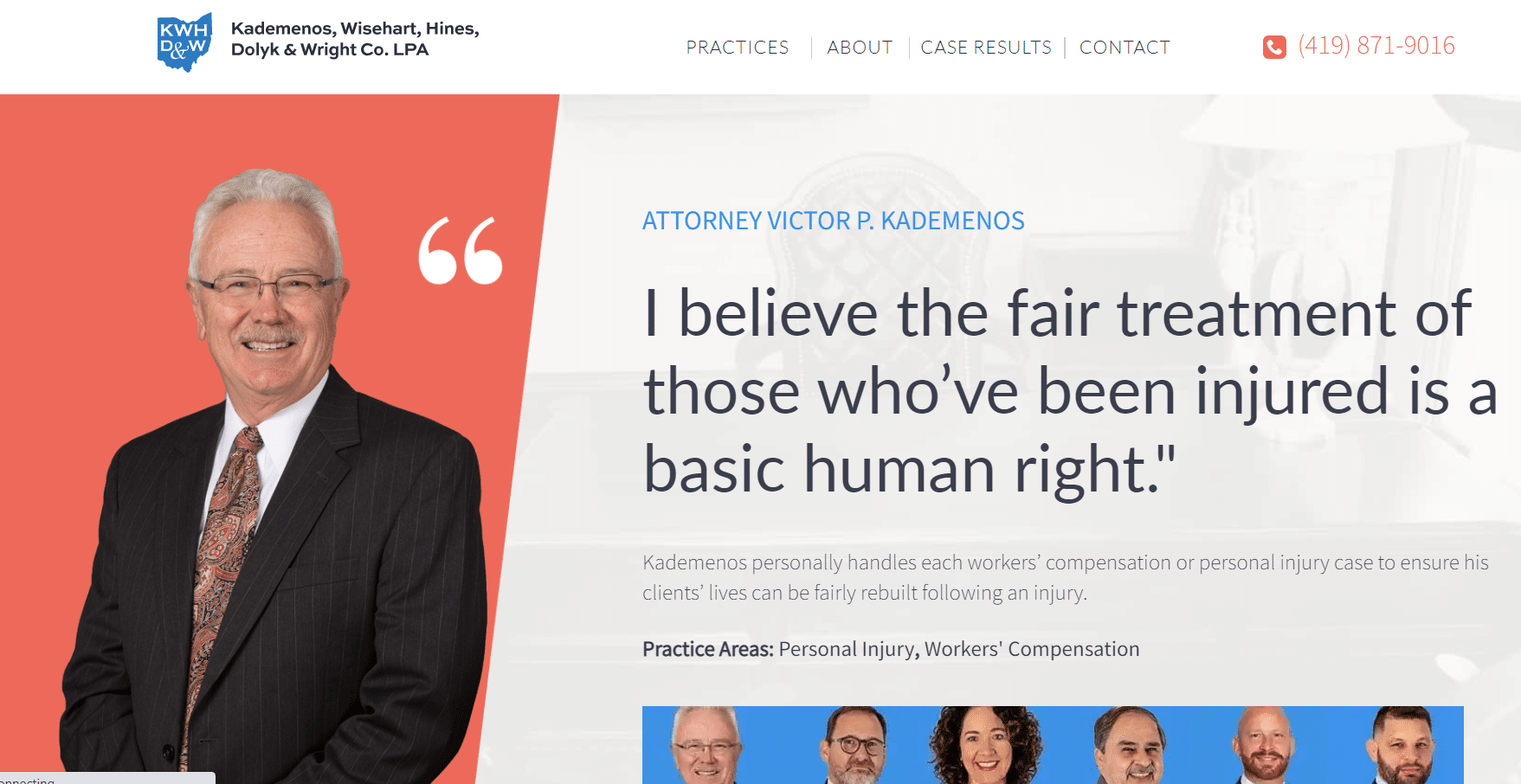
This website features a basic, but clean design with an easy-to-navigate structure, and custom-created images that showcase the firm’s branding and team members. You can create such a website using a template on WordPress.
41. Adam Leitman Bailey, P.C.
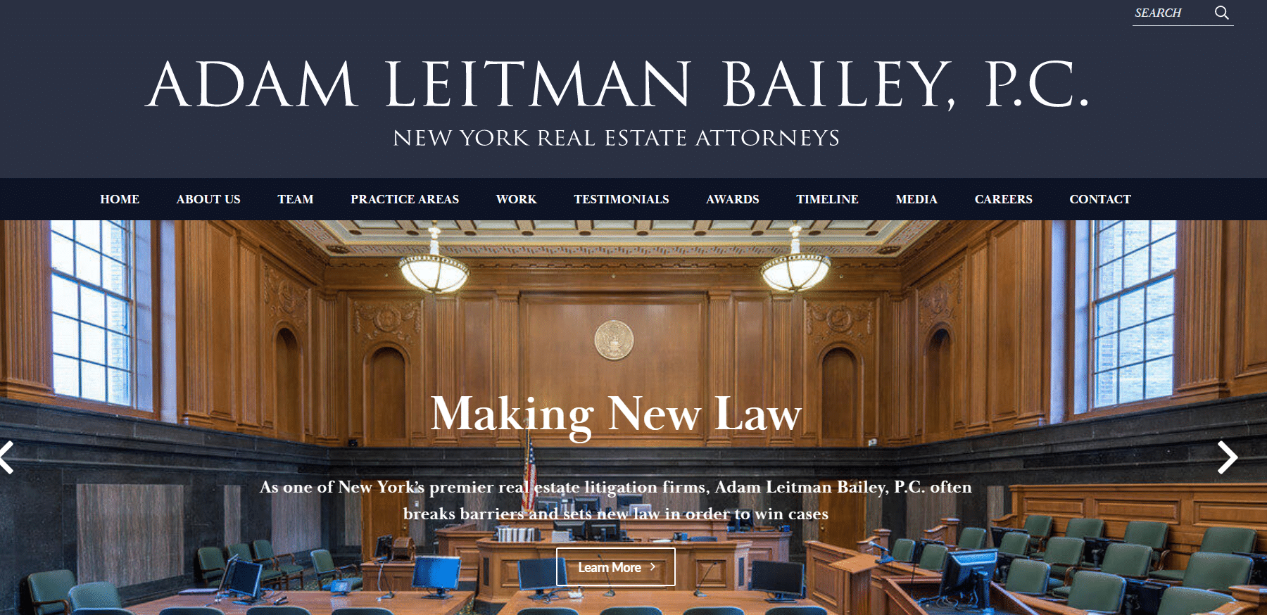
This estate law firm website stands out with its high-quality corporate style images and engaging content. Specializing in real estate and estate planning, the New York-based firms’ website has a basic but clean design and offers smooth navigation.
42.Vogel LLP
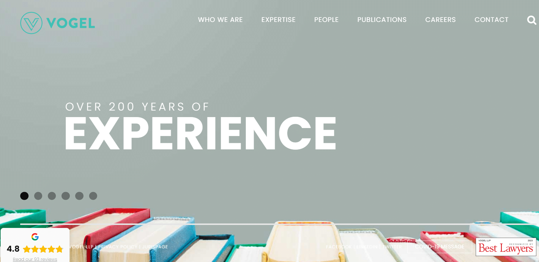
The unique style of Vogel LLP website is characterized by a simplified page layout but has a bit of complex navigation. Despite the unconventional design, this website is good for its information on a range of legal services.
43. Parris Law Firm
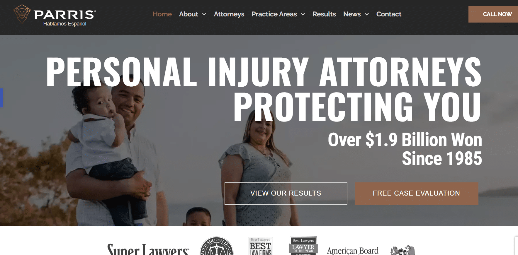
This attorney website features a modern design structure, which could’ve been made better with high quality photos.
44. Family Health Law

This attorney website boasts animation-heavy sections, which can be visually appealing but may feel like too much at times.
45. Charthouse Lawyers
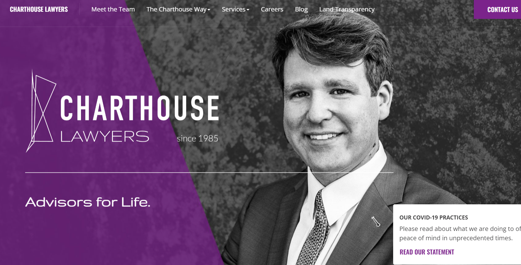
Charthouse Lawyers’s website features a basic but clean website design that’s easy to navigate. While the website may not use traditional color schemes, it still exudes professionalism and provides valuable information on legal services.
46. MayesTelles PLLC

As the premier criminal defense firm of Arizona, this website showcases over 100 years of combined experience right off the bat. With a hero image featuring over 20 attorneys, the website highlights its status as a big and premium law firm. The easy navigation and good color contrast used in the website design make it effortless to find valuable information.
47. Knutson+Casey

Knutson + Casey’s attorney website features an element-heavy design that looks visually appealing, but may lead to decreased usability.
48. Surrano Law Offices

Surrano Law Offices’s website boasts a clean design that showcases its credibility right off the bat. The site features engaging videos and photos that add to its visual appeal. However, some of the photos have strange overlapping color elements.
49. Akin Gump
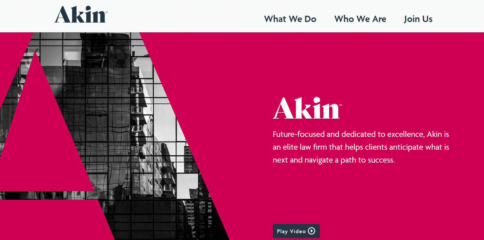
The New York firm’s website incorporates a range of corporate images that add a professional touch and appeal to potential clients. The navigation is seamless and easy to use, providing an optimal end user experience.
50. Hipskind & McAninch, LLC

The overall design of the website is polished and user-friendly, ensuring that visitors get an optimal experience. The attorney bios feature the enhanced attorney analytics (EAAT), which makes it easier to compare different attorneys and their respective areas of expertise.
51. Liberty Man Law
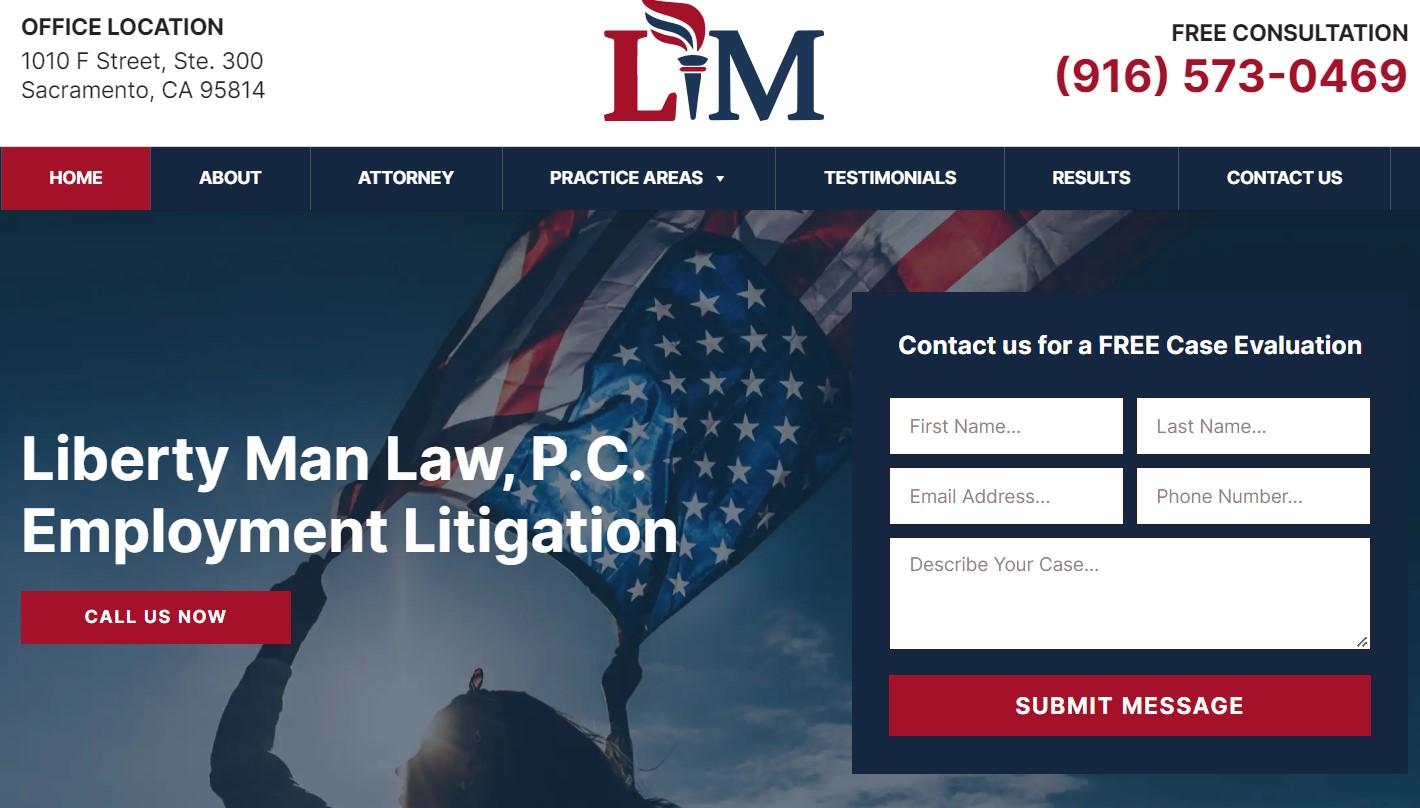
Liberty Man Law has a modern, user-friendly website with good color combinations and smooth animations. With an enjoyable browsing experience, the users can navigate the content with ease and find essential information like booking a free consultation call, their phone number, or law practice areas and specialties quickly.
52. Insurance Lawyer in Florida
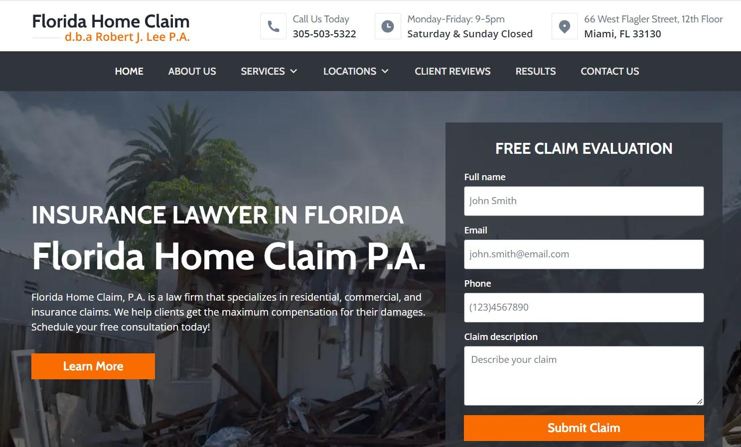
This website exudes trust and reliability to its users with its bold and confident style. The website’s detailed design and professional theme, along with a great color palette, help establish the firm’s brand identity and create a memorable user experience.
53. Wattel & York
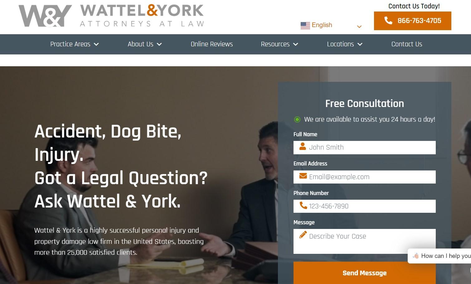
Wattel & York’s website has a high-contrast look that leaves a lasting impression on users. This design choice helps the website stand out and grab its users’ attention. Plus, the unique practice areas section sets this website apart from others in its category.
54. Richard Hochhauser DWI & Criminal Lawyer

The advanced structure layout and high-fidelity photos make this criminal defense website look professional. Plus, the thoughtful design and high-class color scheme of the defense attorney website make it super easy for users to navigate through the content and find the contact form, case studies, and other necessary information that they need.
55. West Coast Trial Lawyers

West Coast Trial Lawyers is a well-designed website that impresses visitors with its professional theme and detailed design. The carefully chosen color palette complements the high-fidelity photos used throughout the site, and the advanced structure layout makes it easier for web visitors and prospective clients to find the required information.
Law Firm Website Design Best Practices
Now that we have discussed some examples of great lawyer websites, here are some best practices for web design you need to keep in mind.
1. Go Above and Beyond to Improve the User Experience
For lawyer websites, user experience is the number ranking factor. It increases customer acquisition and loyalty and has a positive impact on your overall revenue generation.
Here are some quick tips for beginning with:
- Optimize for white space
- Simplify navigation and ensure your website works well on mobile devices
- A user should be able to easily access information they are after
- Describe your services and your process of working with clients clearly
- Display your contact information prominently
- Implement online client intake
2. Optimize Your Website for Search Engines
Search engine optimization (SEO) is another important factor for law firm sites as it helps you get in front of your target audience. Here are some essential SEO practices that you should implement:
- Optimize for a high page loading speed
- Ensure website accessibility
- Make your website mobile-friendly
- Implement a solid SEO strategy
3. Establish a Memorable Identity With a Strong Brand
Developing a strong brand is a moat against competition. Starting your homepage, your value proposition should be clear and compelling.
Here are some quick tips to start with:
- How is your law firm different from competitors? Establish that in your tagline!
- Use high-quality images and videos to represent your firm on your website
- Put your primary practice area pages front and center
- Display testimonials from past clients to build trust with prospects
- Publish educational and helpful content to demonstrate your expertise
Common Questions About Law Firm Websites
Why would a law firm not have a website?
Lawyers are busy folks with little time on their hands beyond serving clients. Small law firms may lack resources to build a website. For many firms, they already might have enough clientele, so they feel a website won’t be worth it. But you need a sound online marketing strategy in place to stay competitive in 2023 — and it all starts with a lawyer website.
Can a law firm have multiple websites?
Unless you have a specific business strategy in mind, having two websites makes little sense. You’ll be diving your resources across them and may need a separate marketing strategy for both. You can have a single website even if you serve multiple locations, and get it to rank in both places. Your firm can also register domains that are misspellings of your firm’s name — but that’s not owning a website.
Why do lawyers need websites?
Lawyers need websites to establish an online presence, provide information to potential clients, build credibility, improve visibility in search engines, and provide a platform for content marketing.
It’s Time You Upgrade Your Law Firm Website’s Design!
Whichever practice your law firm specializes in, your legal practice needs professional branding. A high quality website design is the starting point for that.
I hope the attorney website examples in the article provide some design inspiration. Now craft a compelling law firm website keeping user experience, branding, and SEO in mind.
If you’re short of time, we can design your website — just contact us with your requirements. And we’ll get back with a free quote.
Up next, read our article on best law firm logos or explore some WordPress themes for law firms. You can also get inspiration from our coverage of more law firm websites for specific practice areas: